Someone recently asked me: "What is the differentiating factor between guidelines that people use after handover vs those that stay in a drive somewhere and then go to waste?"
That's a question I wish I'd asked myself years ago.
When your data tells stories that could drive real change (funding decisions, policy shifts, consumer behavior…) a visual language that fails to convey your organization's expertise is a big missed opportunity for impact.
For years, I created data visualization guidelines following the standard agency approach: investigate the brand's history, its visual identity, and weave those details into beautiful chart examples… everything from traditional visualizations to editorial pieces.
In most cases, that worked beautifully.
But.
Starting with the visual aspect, never with the daily reality people would face, optimizes the new language for ideal scenarios. It completely ignores how our beautiful custom spacing would take too long to design on a deadline, or how our perfectly on-brand divergent color palette wouldn’t work with specific, and common, datasets.
Real data visualization work is messy. Especially when you're already stretched thin, juggling a product sprint or a report deadline…
And that's where an aesthetics-first system breaks down.
Visual identity alignment and adoption should be equally important measures of success, because beautiful data visual languages that don't get used are just expensive art projects.
Why humans are terrible at following guidelines
When we're creating a new visual language for teams to adopt, we're asking for a behavior change: let go of default rainbow colors, apply consistent spacing, choose appropriate chart types. All those changes require time and effort in already busy workflows.
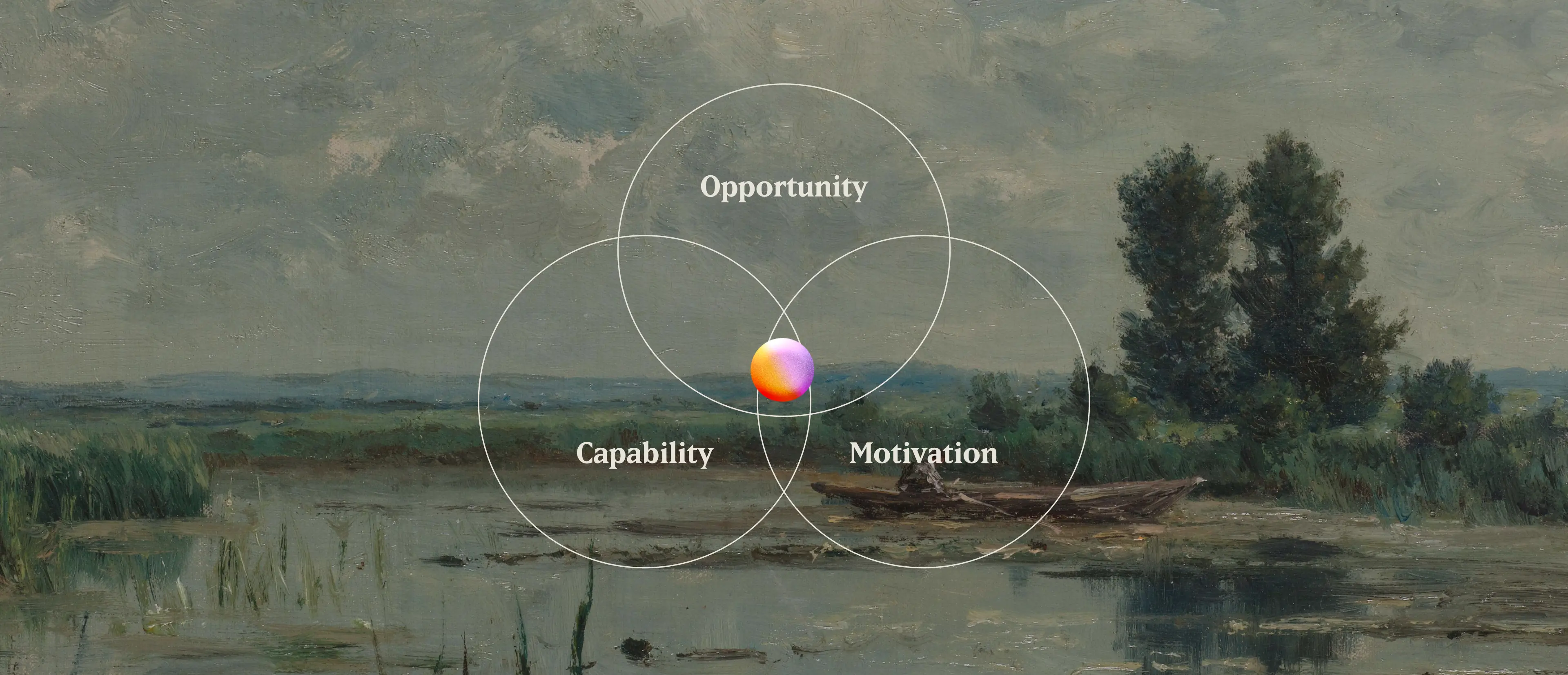
With this in mind, we find it helpful to think about it through this framework called the COM-B model that breaks down in simple categories what helps behavior change.
- Capability: Do people have the knowledge, skills, and confidence to implement the new visual language?
- Opportunity: Does their work environment—tools, workflows, time constraints—support the new approach?
- Motivation: Do they have compelling reasons to embrace this change?
When visual languages fail to take hold, it's usually because one or several of these factors weren't considered.
What this means for creating or refining a data visualization identity
Okay so the first step shouldn’t be a dive into visual identity for inspiration.
Instead, we need to understand how people connect to those three factors:
- What capabilities do they have today: are they comfortable with making complex charts, with missing data, with color palettes that serve both brand and function?
- What constraints are they working with: software that limits font choices, tools that won't let you stack legends above horizontal bars (looking at you Tableau), or simply working with Canva and PowerPoint because that's what the budget allows?
- What would actually motivate them to embrace a new system?
Two steps can help with this process:
- Auditing existing work lets you spot what's been done, where things get stuck, and what mistakes are most common. This gives you a baseline understanding.
- Interviewing your users is the only way to really understand what’s going on during production. They’ll explain you that the color mistake you keep seeing might not be a choice, it might be that their software doesn't allow for the preferred option or that your bold extended brand typeface which looks great in headlines, becomes illegible at the small sizes required for chart labels (True story).
And yes, this process takes time.
But it helps you understand who's actually at the end of the workflow, what their current reality looks like, and how to create a data visualization language that carry your mission forward while actually supporting the people trying to implement them.