Hey y’all, timour here!
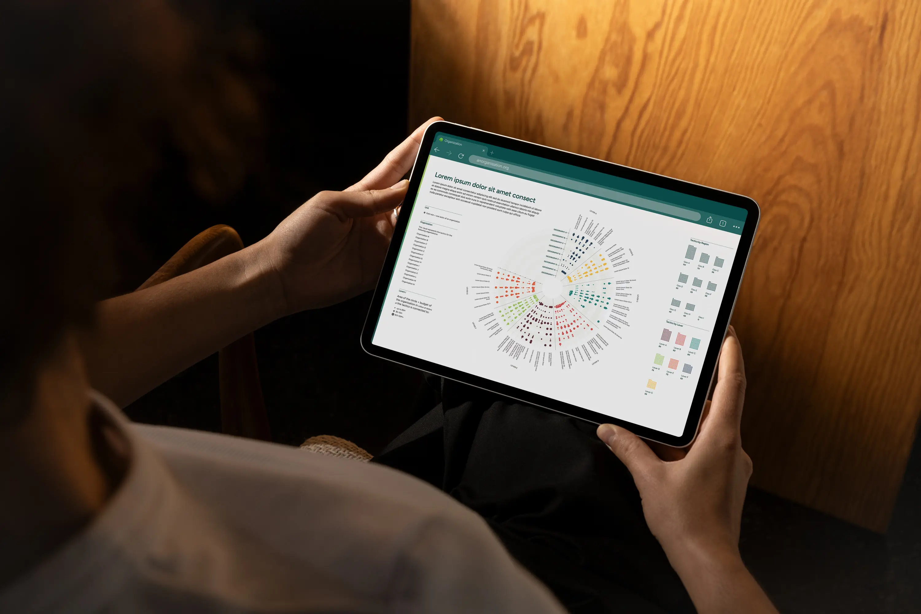
Today I want to tell you about a project we did last year with a philanthropic foundation: mapping the ecosystem of regranters in their field. Regranters, sometimes called intermediaries, are organizations that receive funds from larger funders and redistribute them downstream. We were asked to map them.
But before I tell you about the map, I need to tell you about a Word document.
The Word document
In June last year, the first piece of material for this project landed in our inbox. Not a CSV. Not an Excel file. Not even a Google Sheet. A Word document. Six pages. Titled Intermediaries Strategies Taxonomy.
.jpg)
If you have ever worked with dataviz, you know exactly the sinking feeling I was having in my stomach at that exact moment. When the source material shows up as words on a page , you can reasonably know two things: the dataset probably does not exist yet, and you are now in a beautiful, unknown land way upstream from the comfort zone of your design software. Welcome to the discovery phase.
Our research partner, Thomas, was deep in the process of figuring out a framework to organize his work. He had not started collecting data because he was still trying to define the structure the data was eventually going to take. And he was generously inviting us into that process before he locked anything in. This is, in theory, the dream.
Most information designers would kill to be involved that early. In practice, it means we were now also a researcher.
What we did first (and why it didn't work)
Thomas had this rich, evolving taxonomy of strategies that regranters can use to drive change in the food system, with finer tactics nested underneath. His research was built around the organizations: who they are, what they fund, how they operate.
For example, two organizations could be focusing on policy & governance (the strategy) but while one of them is advocating to change public procurement (a tactic), the other might be leveraging stakeholder participation in decision-making forums (another tactic).
That framing made complete sense for his work. So we tinkered around the edges. We made some conceptual diagrams and talked about possible visual directions without making any strong commitments. We were, in a word, careful, and every diagram we made put the organizations , and their amazing work, at the center.
Each meeting was taking us further down the rabbit hole however. Each question brought new questions. Each answer brought new questions as well. It seems as if there was always something else that needed to be taken into consideration or a new perspective that was worth exploring.
But the clock was ticking and soon enough, we were showing our wonderful client, the funder paying all of us, what we had made. And...
They were annoyed.
They were polite about it ("we appreciate the thinking") but it meant...
can we get to the point.
They had hired us to move the project forward and we kept turning the question back to them. We hadn't achieved anything new. It was time to start being more prescriptive, but where to start?
The pivot
We stopped trying to design our way out of the problem, and started back with the data structure instead. The framework we reached for is one we love called tidy data principles.
Tidy data, as a concept, comes out of the data analysis world. It says three things:
- Each observation forms a row
- Each variable forms a column
- Each cell is a single measurement
It is rigid by design. And the rigidity is the beauty. Because once you commit to this structure, you are forced to answer the question that most data viz projects spend weeks tiptoeing around: what is the base unit of this dataset? What is one row?
In our case, the obvious answer was: a regranter is one row. We were mapping regranters. Each of them are an observation. Easy.
We sat with Thomas, and started laying it out. And about ten minutes in, one of us, I don't remember who (just kidding, it was Gabby ofc), said the sentence that pivoted the project:
Wait. The base unit isn't the organizations. It's the tactics.
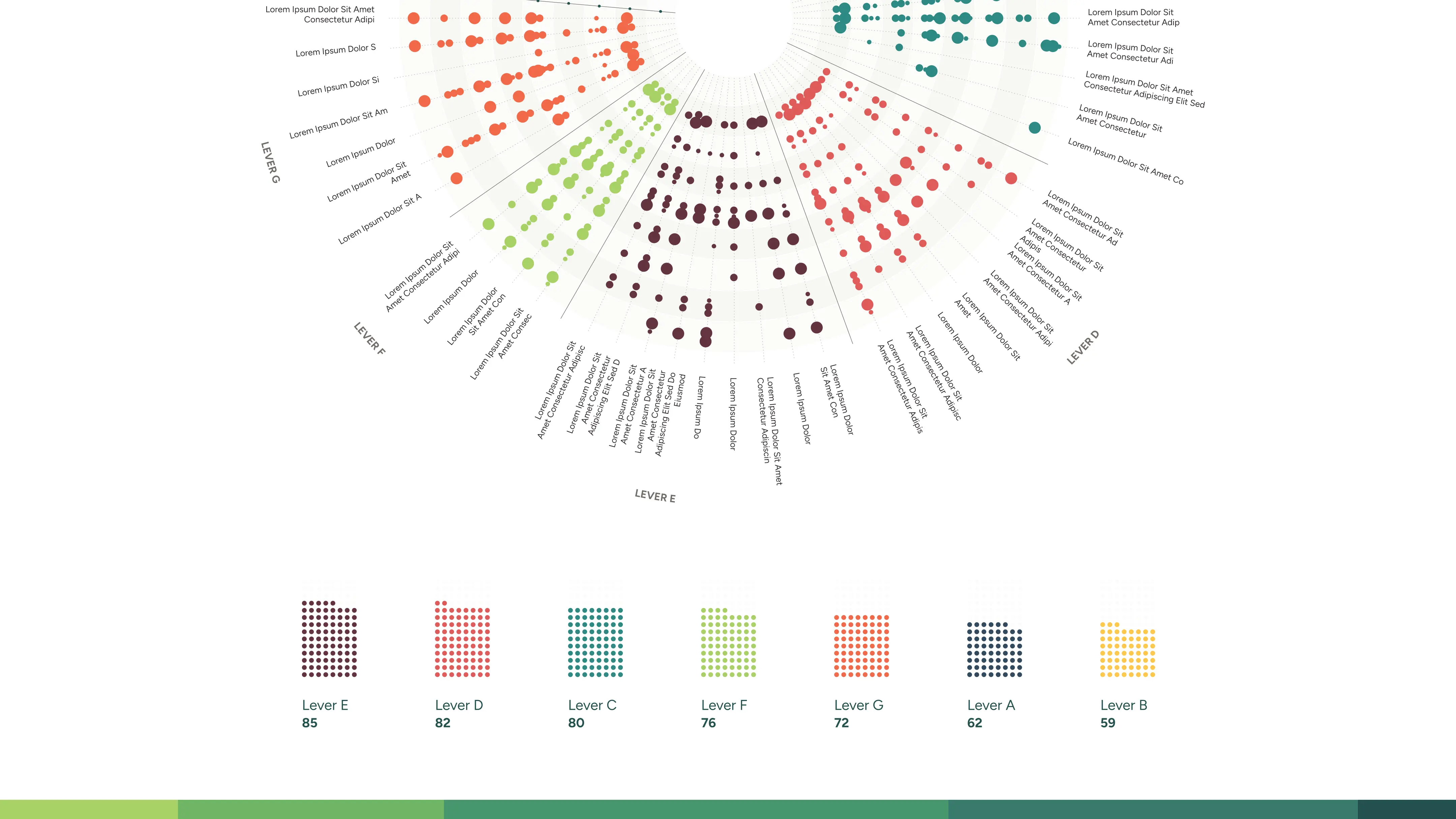
We were not trying to visualize the organizations. We were trying to visualize the tactics used across the field of climate regranting. The organizations were just the entities that employed them.
Or in tidy data world, the organizations were variables (which we refer to internally as attributes at F&F) attached to tactics. This means:
- Each tactic could be employed by many organizations.
- Each organization could employ many tactics.
The taxonomy that Thomas had built wasn't a column of the dataset. It was the dataset.
The moment we accepted that, everything unlocked. The structure of the file changed. The structure of the analysis changed. The shape of the eventual visualization changed.
And, this surprised me, Thomas seemed visibly relieved.
He had been waiting for someone to be that prescriptive. Researchers tend to question forever if no one draws the line. The researcher had been waiting for someone to draw it. To set a boundary within which this rich dataset could be presented, and digested and understood. To be visualized.
The dungeon master problem
There is a quote I think about often, from Abed Nadir on Community, in the episode where he plays a dungeon master:
I am a dungeon master. I create a boundless world and I bind it by rules.

That is the job of an information designer, especially one working with qualitative data.
The gift of this project was the qualitative depth, the taxonomy, the strategic richness, the years of context Thomas brought. The curse of this project was the same thing. Qualitative data is boundless. It does not arrive in a tidy table. It does not want to be in one. It is subjective, contested, fuzzy at the edges. And yet, if you want to turn it into a tool that humans can use to make decisions, someone has to bind it by rules.
Tidy data principles are one such rule-binding. They are not the most interesting rules in the world. But they are the rules that let the rest of the interesting work happen.
Thank you
Credit to the talented information designer, Daria Niko, who joined us through this adventure. She thought deeply about the content, and brought a lot to the project with her inquisitive mind. We love her visual translation of the data. Sometimes you only realize how stuck you were when you stop being stuck.
If you are working on a project where the data has not been collected yet, where the structure is not obvious, where the question itself is still being negotiated, that is exactly the kind of work we like.
—Timour Scrève, Sensemaking Lead at Figures & Figures