Strategy & Co-facilitation
Timour Screve
Visual Design
Daria Nikolaeva
Design Strategy & Creative Lead
Gabrielle Merite
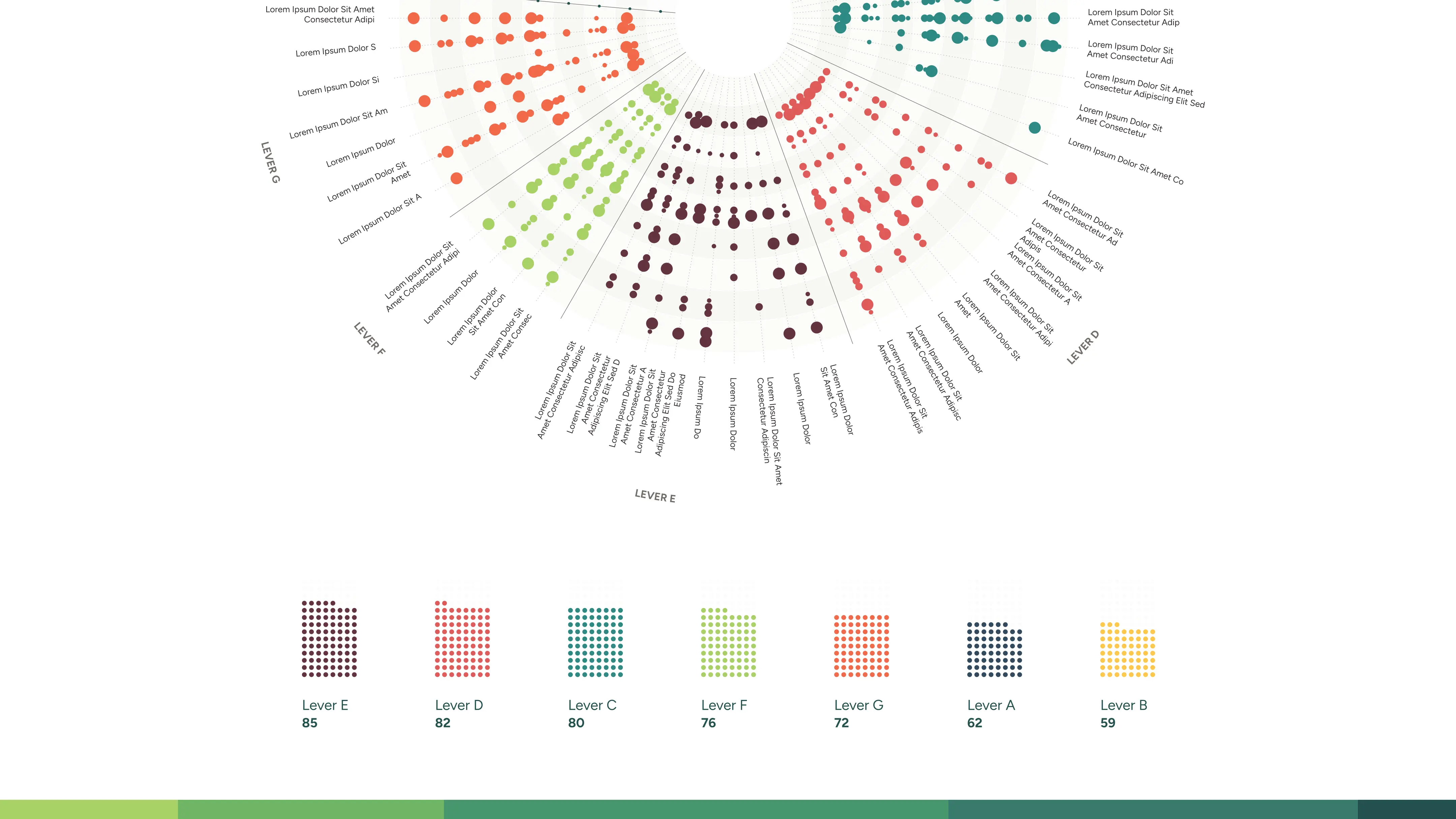
The food-climate philanthropy field has grown quickly, but without a shared map. Intermediary organizations are each funding transformative work from their own corner of the landscape: their own theory of change, their own terminology, and a geographic logic all their own. No one could see the whole, and the foundation wanted to tackle this issue. Ask any of the regranters to fit into a single category, and they would push back, rightly, that their work was too nuanced for this. We needed a map that didn't require anyone to simplify their work.
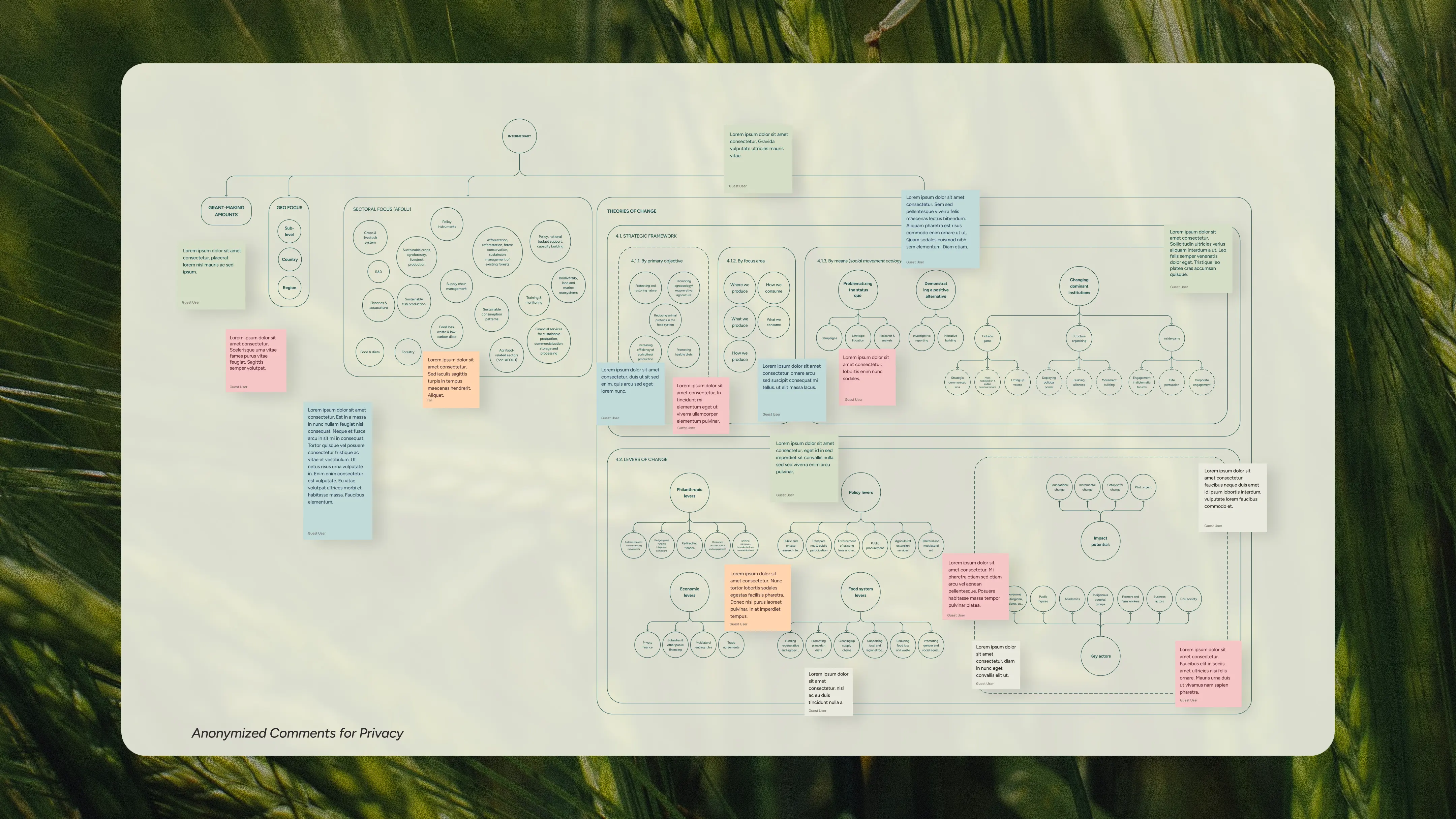
Before the data was ready, we joined the research process to co-design the taxonomy alongside Thomas Legge, the independent researcher leading the project. We ran a live working session in FigJam with fifteen funders across four analytical dimensions: grant-making scale, geographic focus, sectoral priorities, and theories of change, each mapped as a tree of attributes funders could recognize themselves in.
The meaningful unit turned out to be the tactic, what a funder actually does: funding an agroecology demonstration project, convening a regional policy working group, building a grantee network. Tactics unlocked the data structure and the visual logic at once. This move from Organization to Tactics being core object collapsed a 100+ category system into a navigable structure organized by geography and lever type, the two dimensions that made comparison possible across very different organizations.
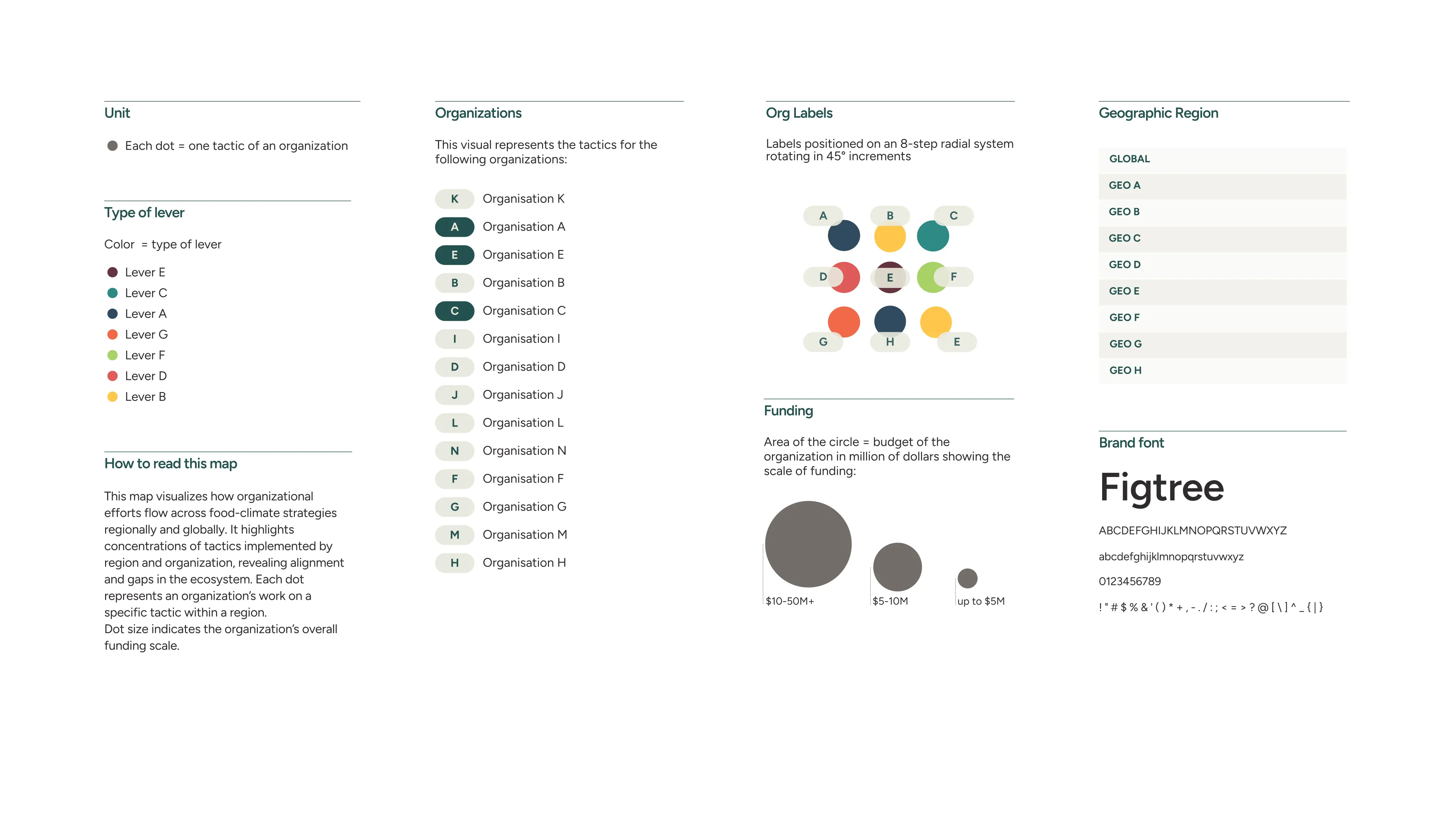
The ecosystem visual maps each tactic as a dot, arranged in rings by geography and colored by lever.
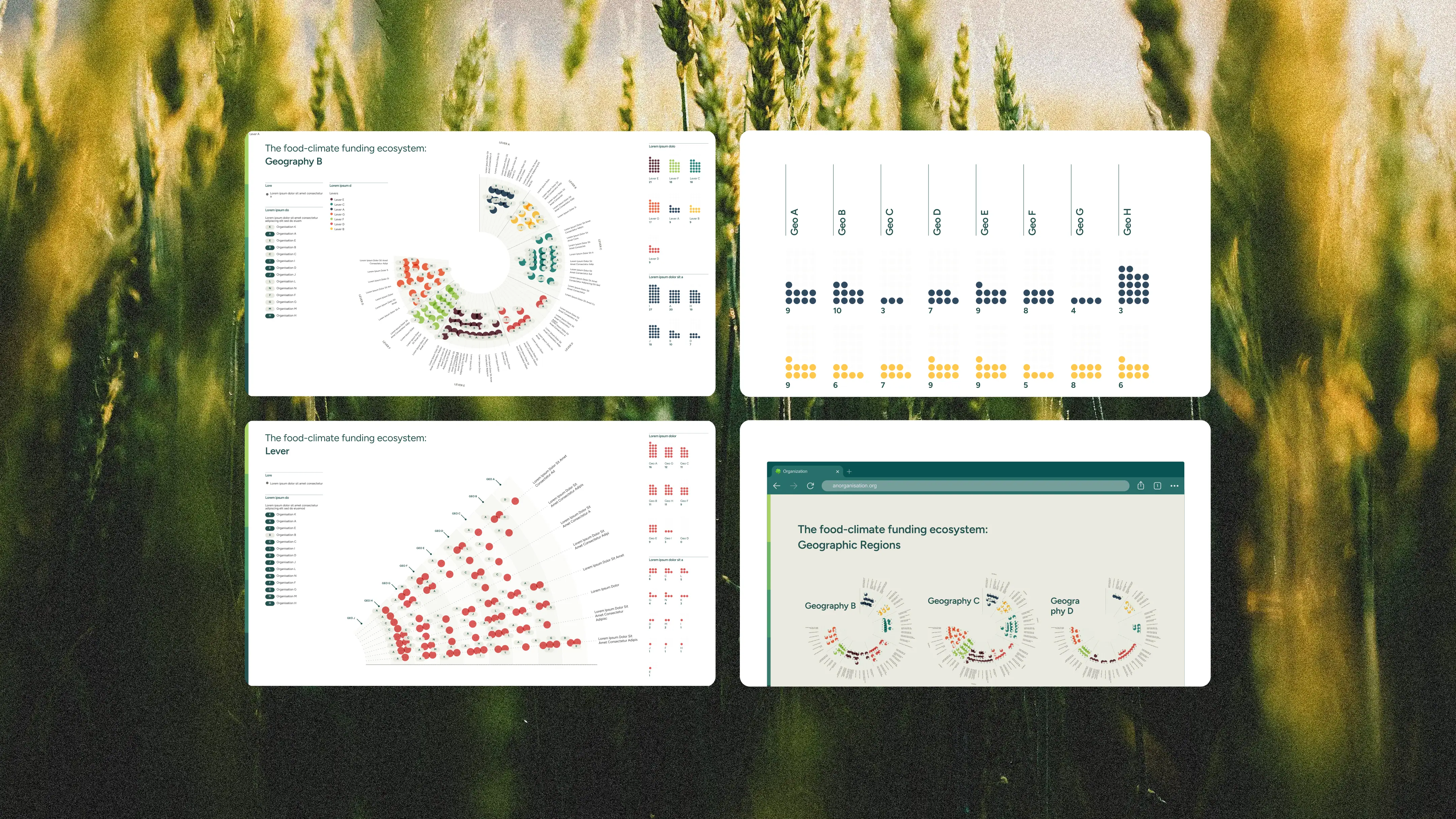
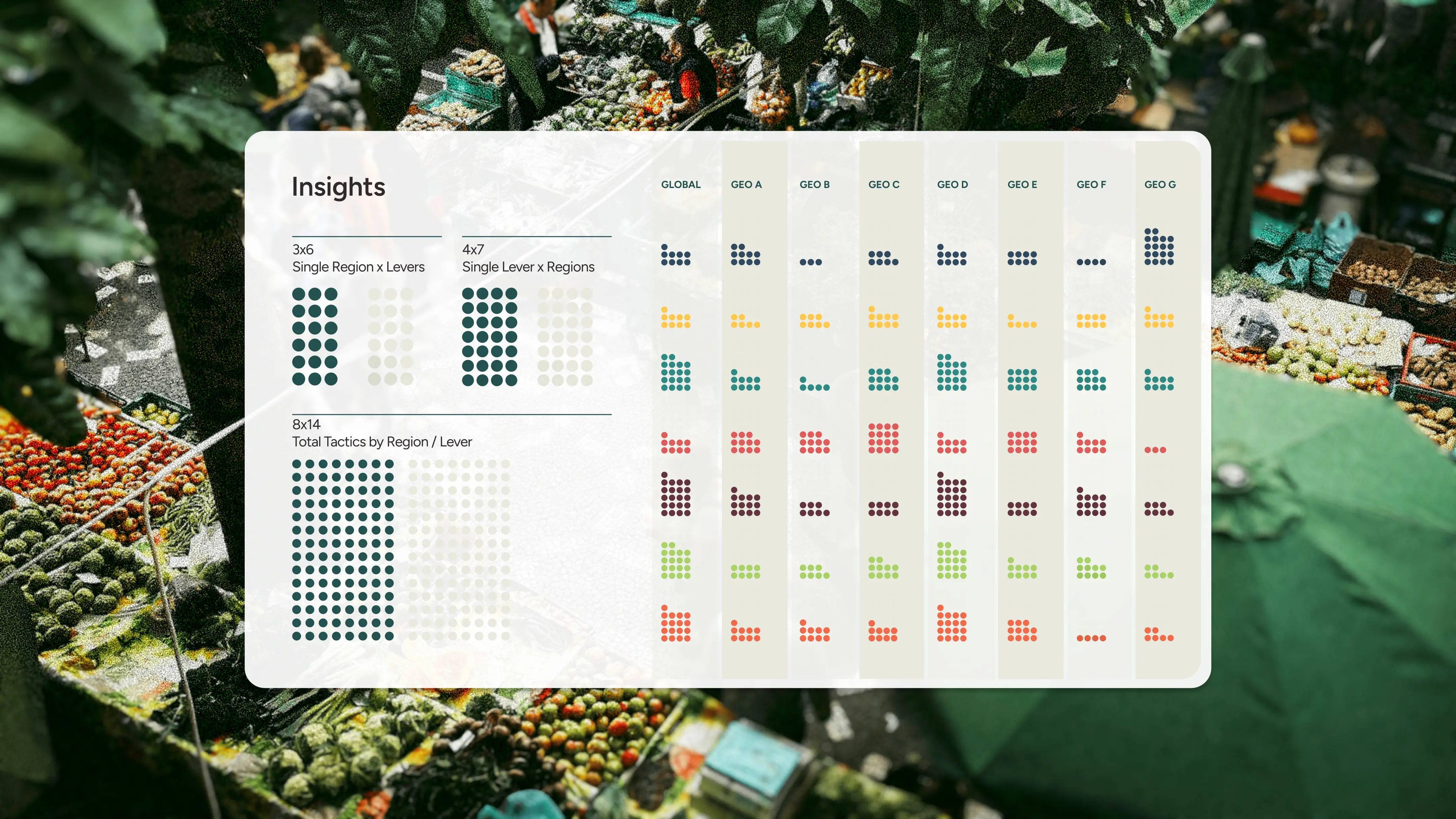
For the first time, 48 tactics, 8 levers, and 14 strategies were legible in a single view. Sixteen assets in total: a full overview plus zoom views by geography and by lever, so any funder could find their corner of the map and see who else was working there, at what scale, and through which tactics.
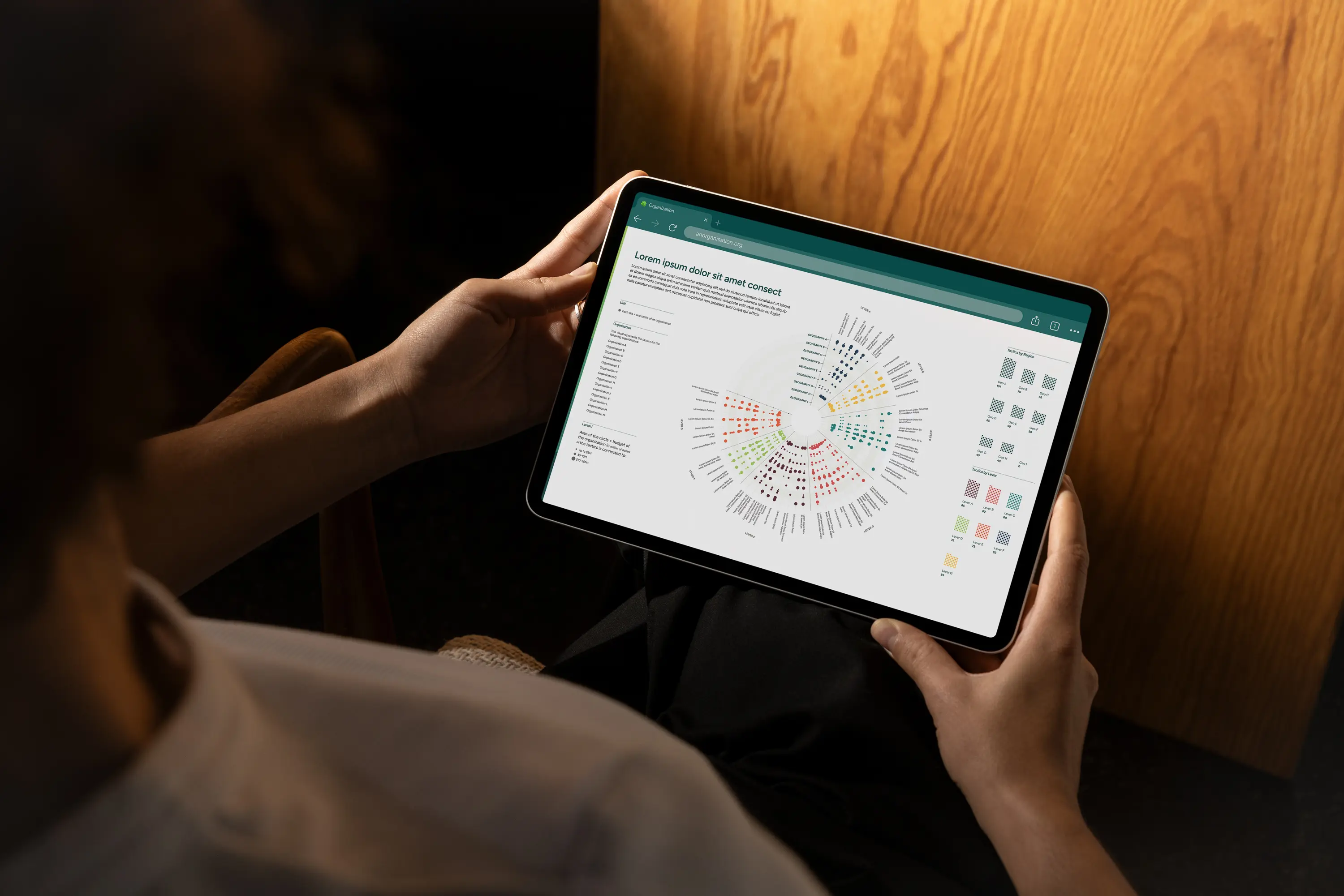
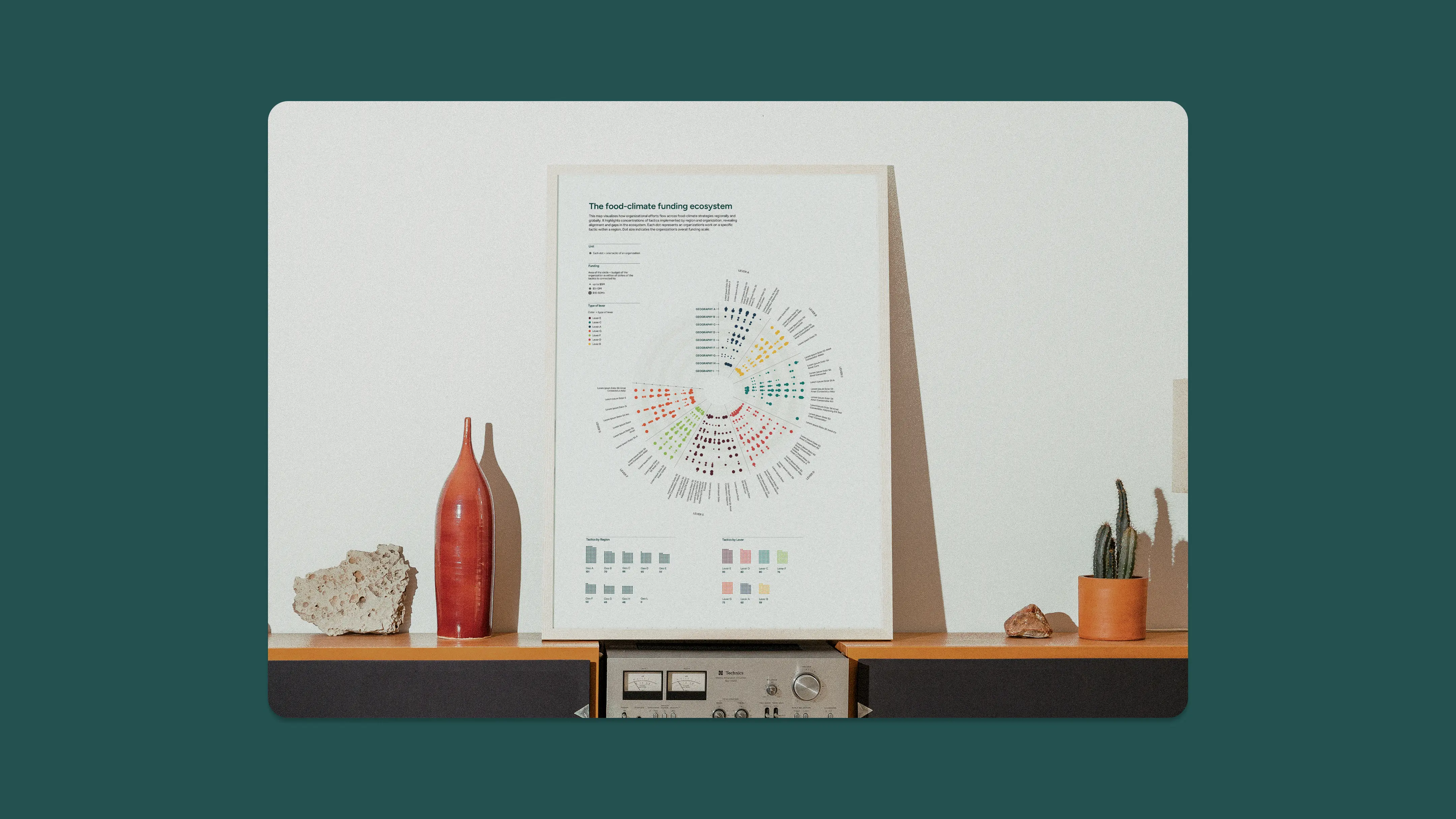
The mapping was presented to approximately twenty-five to thirty intermediary organizations at a field convening in early 2026. Funders left with a shared framework they had helped shape, and a view of the ecosystem none of them had held before.
Thanks so much to Thomas for the research partnership and to the team for trusting us to represent the full range of what organizations do, fairly and without flattening it.
Strategy & Co-facilitation
Timour Screve
Visual Design
Daria Nikolaeva
Design Strategy & Creative Lead
Gabrielle Merite