Deloitte Insights

Expanding an editorial data language into chart templates and infographic frameworks

[ Context ]

Deloitte Insights shape how business leaders see the world. Like main research organizations, they operate in two world: Their magazine features sophisticated visualizations by specialist designers while their website relies on more than 20 designers across the globe with high turnover and tight deadlines.

The beautiful data visualization guidelines from Pentagram's rebrand worked perfectly for specialists of the magazine. But the intricate pattern work and custom imagery proved difficult for non-specialists to execute consistently.

Different systems were needed for daily production.

See the Project
A bar chart shows data for six countries with gray bars and one green bar for "Global average." Red annotation text reads "4PX" and "8PX" with Lorem ipsum placeholder text.
A hand holds a smartphone displaying "Energy & Industrials" content with text and green charts. The phone is positioned against a grey background.
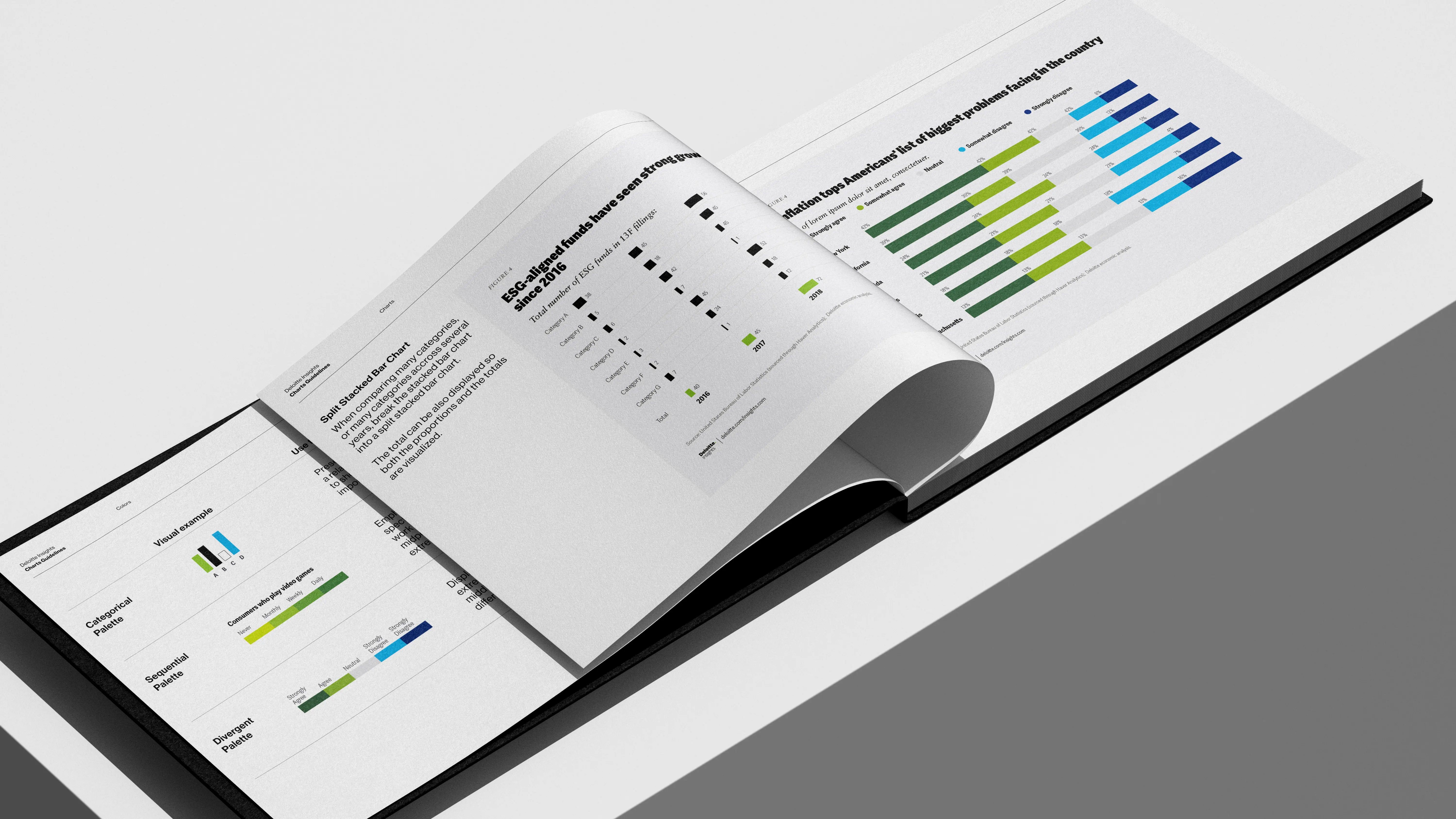
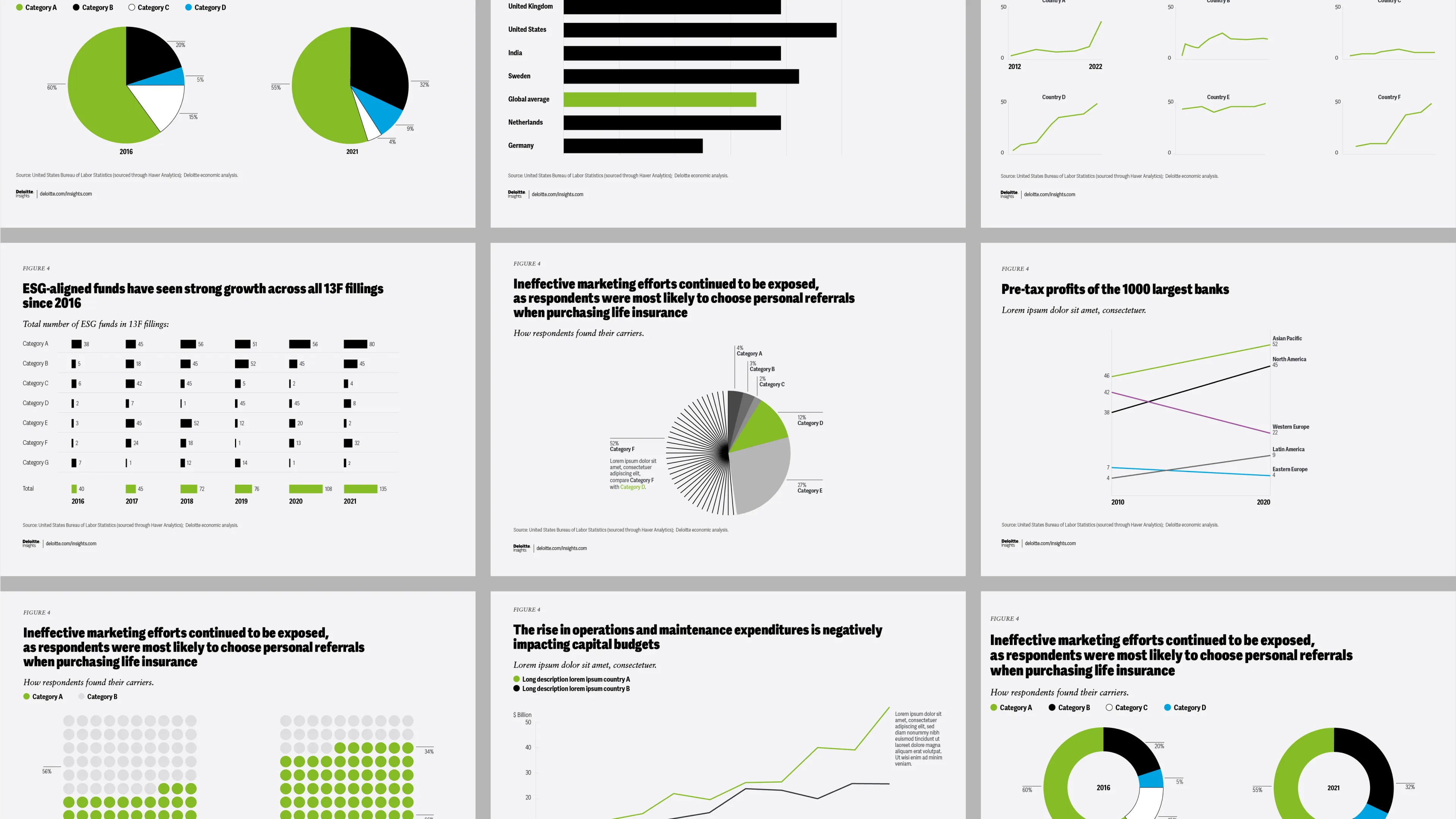
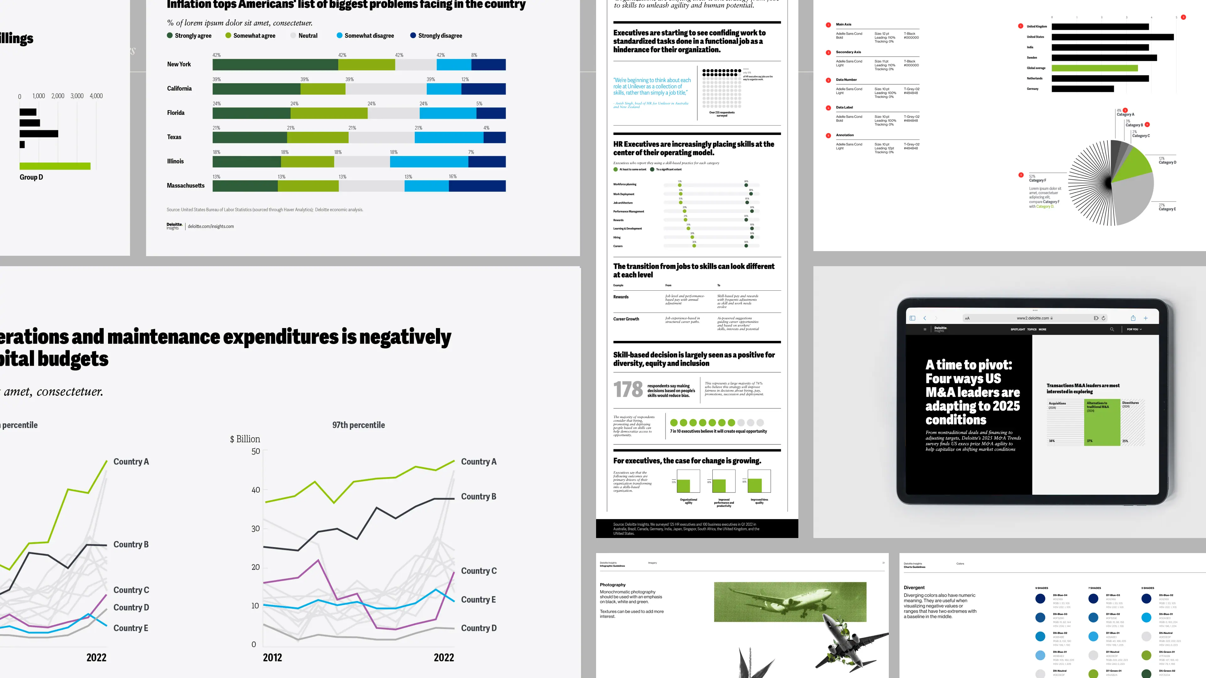
A grid of 9 charts from the Deloitte data visualization guidelines showing pie charts, bar charts, line graphs, and dot plots in green, black, blue, and gray colors.

[ Create ]

We mapped their actual production needs and rebuilt the system to bridge creative ambition with operational reality, working closely with the original design team at Pentagram:
  • Production-ready templates:
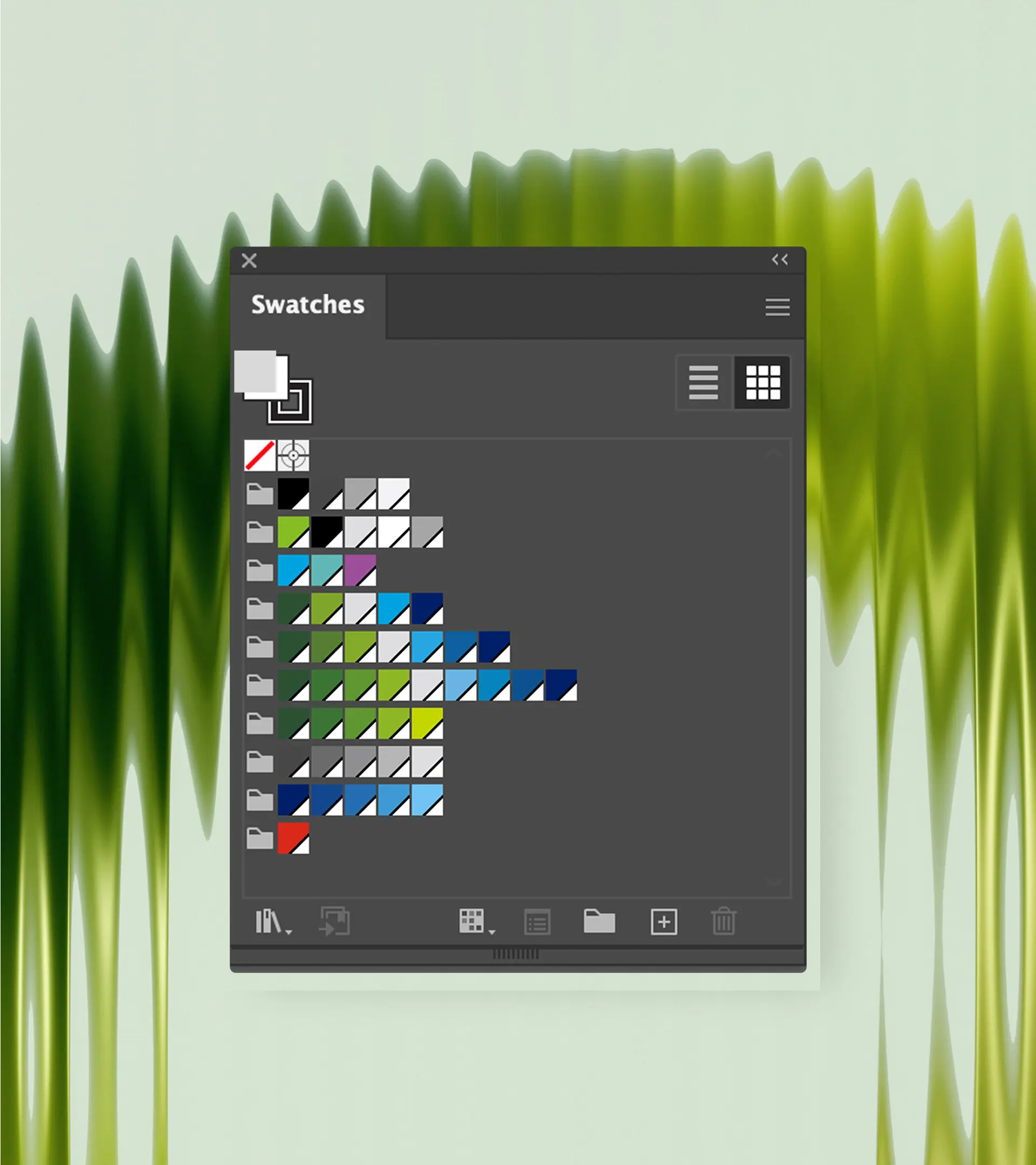
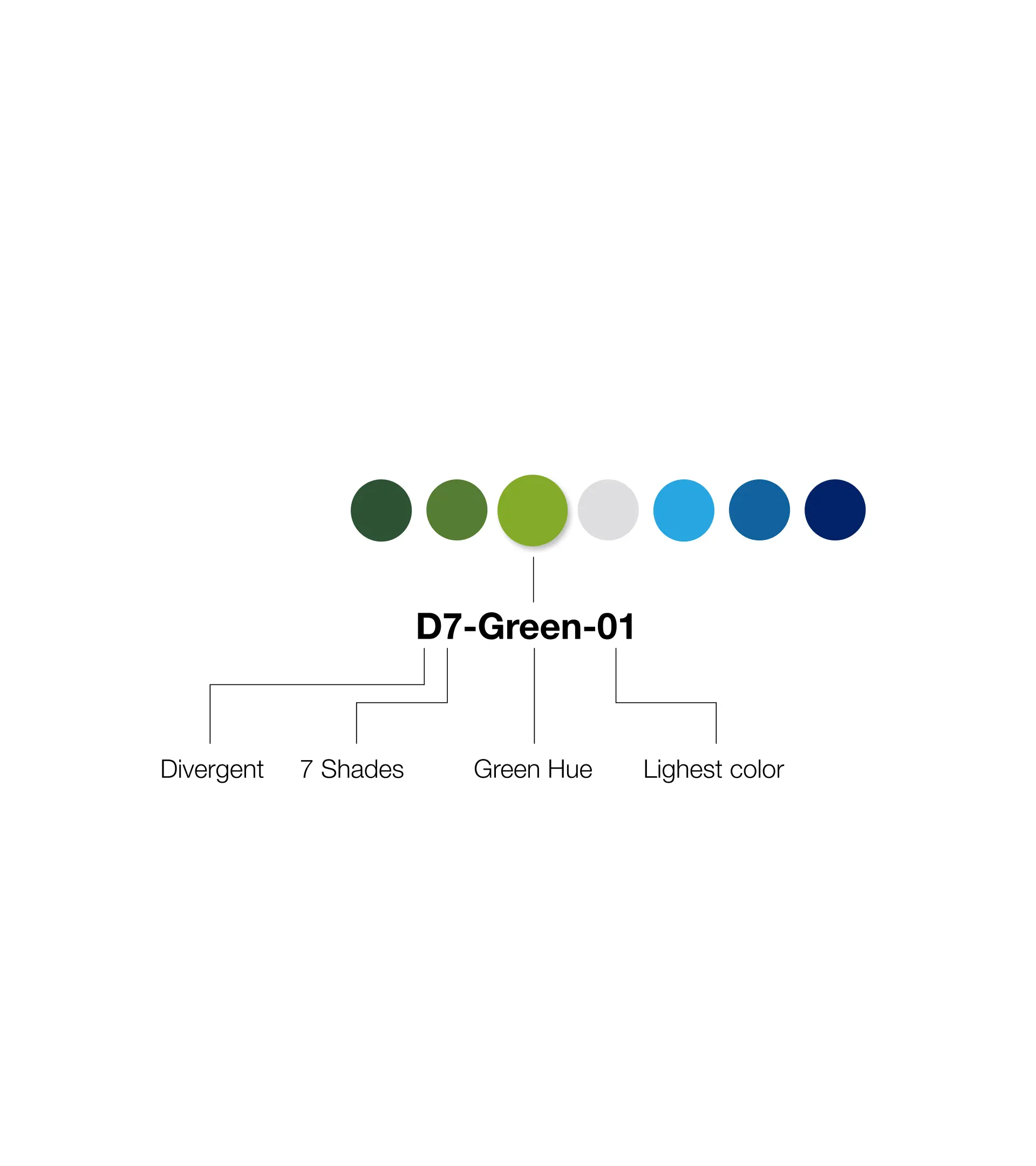
    Built complete Illustrator files with color swatches, naming conventions, and custom brushes, so any designer could start with the right foundation regardless of experience level.
  • Expanded color system:
    Grew their restrictive four-color palette into flexible options that maintained brand integrity while giving teams real choices for different data stories and accessibility needs.
  • Information hierarchy rules:
    Created clear typography and layout standards for infographics, addressing fundamental issues with information organization that weren't covered in the original guidelines.
  • Brand integration tutorials:
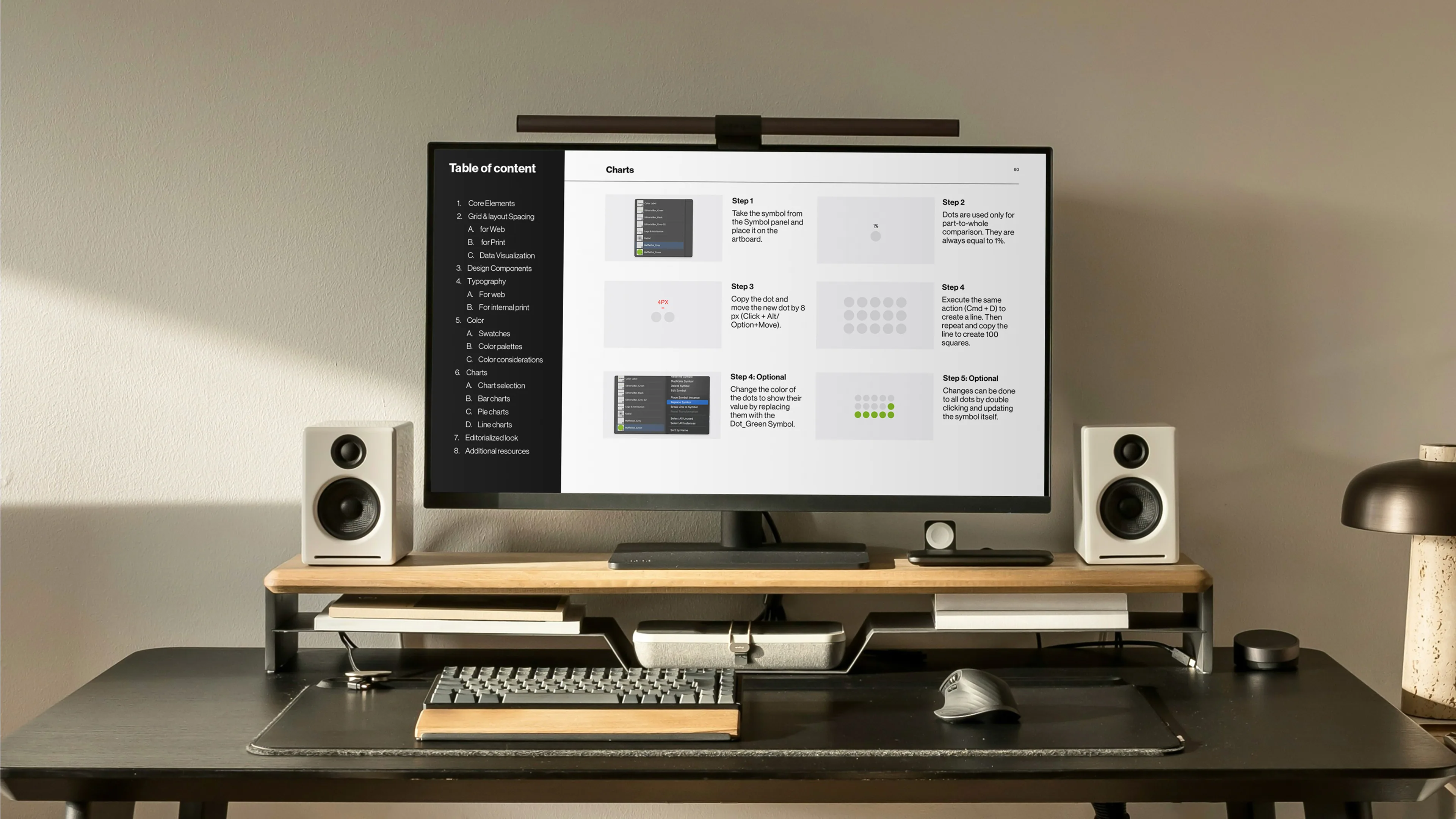
    Developed step-by-step guides for incorporating photography and collage elements—core brand features that production teams didn't know how to execute within data visualization.
Three white cards show data visualization guidelines with horizontal bar charts in green, black, white, and blue. Cards display "Do with care," "Do," and "Do" with accompanying best practice text.
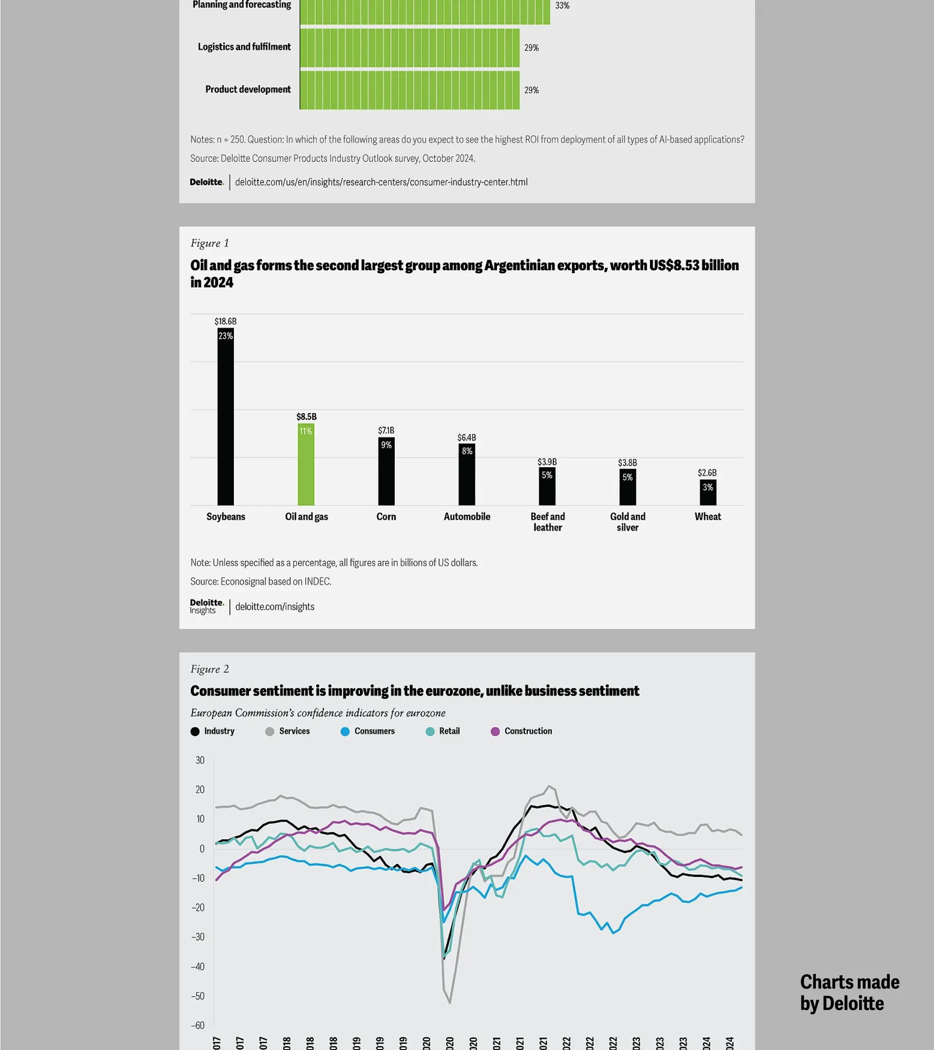
A collage of Deloitte data visualization examples including bar charts, line graphs, pie charts, and infographics displayed across multiple formats with green, blue, and black color schemes.
A laptop displays a Deloitte webpage with a green and black bar chart titled "Most surveyed workers prefer an even mix of human collaboration and AI tools in their work." Text reads "Made by the Deloitte team."
Deloitte design materials on green surface: left side shows scattered colorful pages; right side displays clean data visualization pages with green charts and aircraft imagery titled "Without change, aviation will keep driving climate change."

The production team now creates more consistent charts with fewer revisions.

More importantly, Deloitte's core Data Visualization team shifted from fixing other people's work to coaching teams through data challenges, gaining recognition as internal experts.

See the results across their website

[ Impact ]

[ Credits ]

Big thanks to Giorgia for bringing us on this project and to the Deloitte Insights team for the trust.

Design Lead

Gabrielle Merite

Data Visualization Designer

Gabrielle Merite
Ting Fang Cheng

Project Manager

Madeleine Garner, Pentagram

Pentagram Partner

Giorgia Lupi