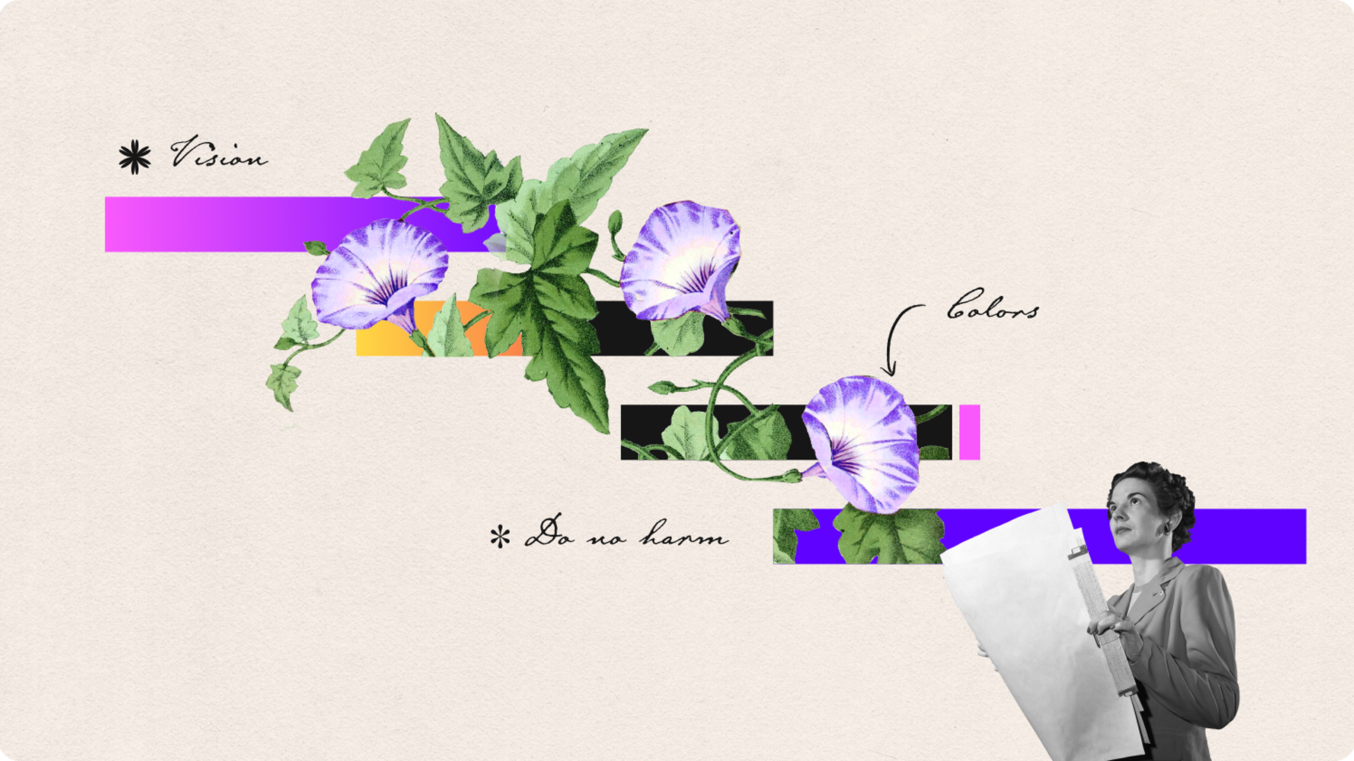
There are 4 buckets of activities in the making of data visualization guidelines:
- Audit: tracking down every single instance of data visualization that has already been produced, the missed opportunities as well as potential future opportunities
- Interview & Workshop: understanding the needs of the different stakeholders and end users of the guidelines, discussing the insights of each phase, and reviewing the design work
- Concept designing: exploring different directions that the visual identity could take
- Guidelines Design: the right chart examples as well as the documentation needed to execute the visual identity, data visualization strategy, and to follow best practices.
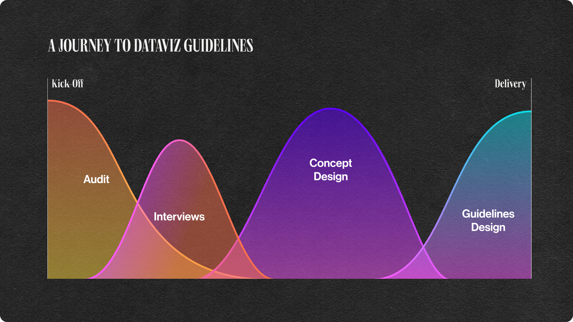
Designing the actual guidelines is generally 1/4 of the work (or less) and always happens once all the foundational blocks are analyzed.
A tailored journey
Every organization is different. Not all stakeholders want to be involved the same way, or at all. Not all end users have the same understanding of colors or basic chart knowledge.
Thus, those activities can look very different from one company to another. Here are some examples:
For a growing accelerator focused on social change whose team had little data visualization experience and will mainly be creating charts for reports and social media:
Project-specific activities:
- a workshop on how to approach charts with an ethical lens
- a creative direction phase on creative data visualization for social media and editorial applications
- a guidelines section on how to work with photography within and next to data visualization
Project length: 3 months
For a corporation specialized in finance risk assessment with 10,000+ employees among which 3 teams had in-depth data visualization experience:
Project-specific activities:
- a report of insights from interviews, with our recommendation on how to implement guidelines and continue updating them in the future
- workshop on color with a focus on dataset-specific palettes
- a discussion on what terminology to use for the chart anatomy
Project length: 4 months
For a large pharmaceutical company going through a brand refresh:
Project-specific activities:
- a discussion on how to use the custom brand font with the right type hierarchy within charts
- a section on how to utilize 3D for data visualization
Project length: 7 months
There is no right way to do guidelines. There are many pathways and the needs and vision of the team and each organization should lead which one to take.
So how to plan data visualization guidelines?
Don’t plan it.
- Start with the audit → identify all existing charts and missed data opportunities
- Interview the main stakeholders and the end users → create a list of all the questions, issues, and concerns the team is currently experiencing as well as their vision for this style guide
- Then and only then, start drafting the plan on the design elements that will need to be explored for your guidelines
.webp)