Data Visualization, Editorial & Digital Design
Gabrielle Merite
Web Development
Commission Editor, MIT Technology Review
Amy Nordrum
Art Director, MIT Technology Review
Emily Long
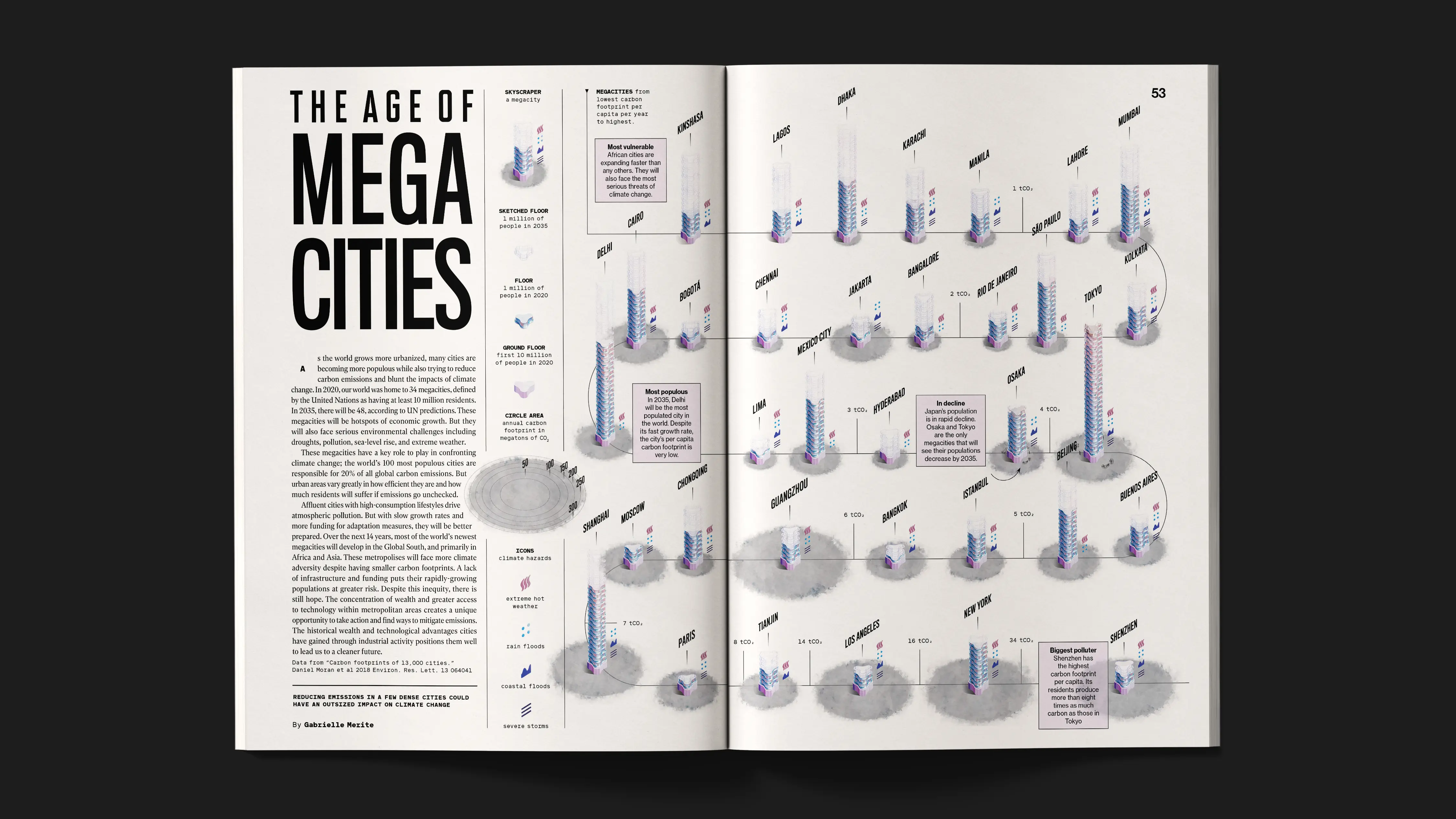
Megacities are growing fast, and they sit at the center of a climate tension that is easy to describe but hard to truly see. The same “megacity” label can cover radically different realities: wealthy, high-consumption cities with outsized per-capita footprints, and fast-growing cities with far lower per-capita emissions but greater exposure and fewer resources to adapt. This story was part of MIT Technology Review’s May/June 2021 issue, The Cities issue. The MIT Technology Review needed an editorial feature that could hold that nuance across web, a magazine spread, and mobile, without turning complex comparisons into noise.
.webp)
.webp)
We translated each megacity into a modern building because architecture is a universal shorthand for the built environment.It lets readers compare cities as systems rather than abstract dots on a chart. The base represents the first 10 million residents, then each additional floor equals 1 million, a deliberate choice to reduce legend-dependence and support quick, trustworthy mental math while scanning dozens of cities.
To keep the story anchored in time (not just magnitude), the 2035 projection is rendered as a lighter, architect-style sketch layered onto the present, so growth reads as a proposed extension. Where projections decline, the “future” darkens and crumbles, a purposeful inversion that makes negative growth legible inside the same grammar instead of forcing a second chart type.
To make the piece strategically useful, we added a compact icon layer for dual encoding: emissions remain readable alongside climate risk, so the story can hold the equity tension between responsibility and exposure in a single view. This turns the towers from a visual flourish into an editorial decision tool—helping readers see why some high-consuming cities carry outsized mitigation leverage while many lower-emitting cities face disproportionate vulnerability.
The system was built as a repeatable editorial module that could travel from magazine spread to desktop to mobile, with explicit guardrails (total vs per-capita emissions, efficiencies of density) to prevent simplistic conclusions.
.webp)
.webp)
.webp)
.webp)

.webp)
The published feature made climate equity visible at a glance: when cities share a common structure, the imbalance between responsibility and risk becomes difficult to ignore. By keeping 33 cities in the system and supporting regional scanning, the story preserves key extremes and invites meaningful comparison instead of cherry-picked examples. The result is an editorial data experience that helps a broad audience understand why action in a small set of high-consumption megacities can have outsized global effects, even as climate vulnerability remains uneven.
_ForWeb.webp)
Data Visualization, Editorial & Digital Design
Gabrielle Merite
Web Development
Commission Editor, MIT Technology Review
Amy Nordrum
Art Director, MIT Technology Review
Emily Long
.webp)