Design Lead
Gabrielle Merite
Data Visualization Designer
Gabrielle Merite
Ting Fang Cheng
Project Manager
Madeleine Garner, Pentagram
Pentagram Partner
Giorgia Lupi

Deloitte Insights shape how business leaders see the world. Like main research organizations, they operate in two world: Their magazine features sophisticated visualizations by specialist designers while their website relies on more than 20 designers across the globe with high turnover and tight deadlines.
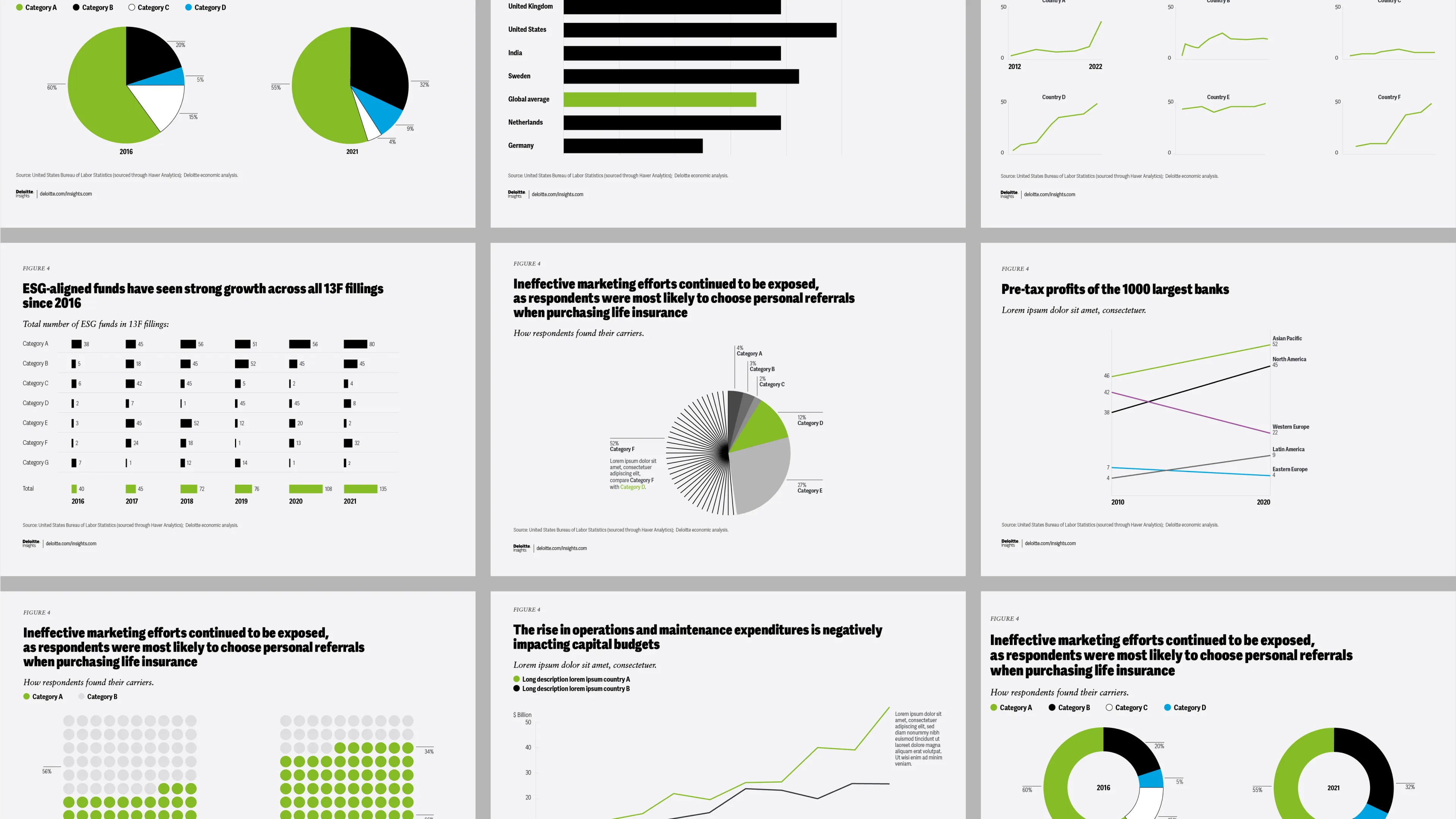
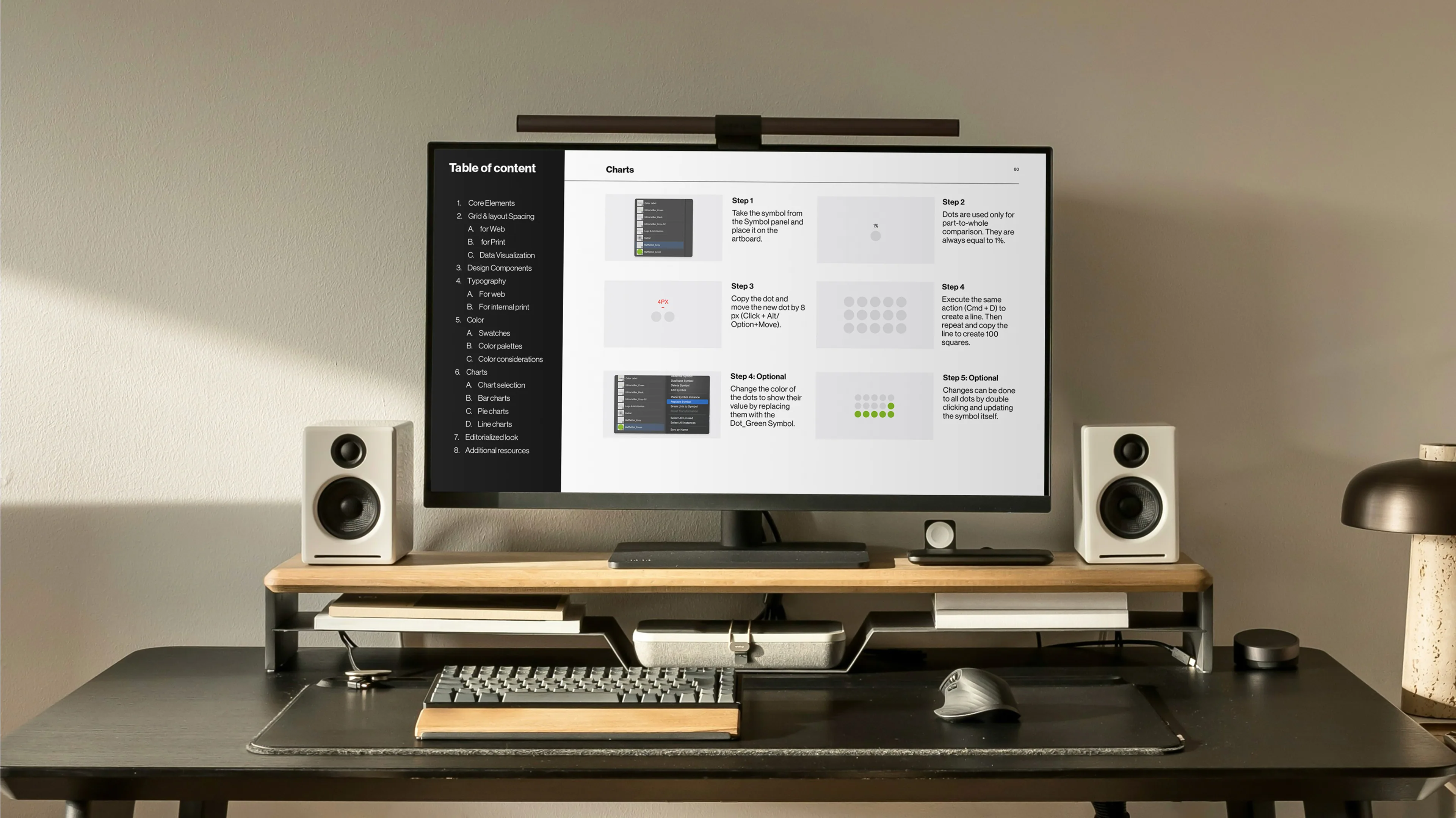
The beautiful data visualization guidelines from Pentagram's rebrand worked perfectly for specialists of the magazine. But the intricate pattern work and custom imagery proved difficult for non-specialists to execute consistently.
Different systems were needed for daily production.
.webp)

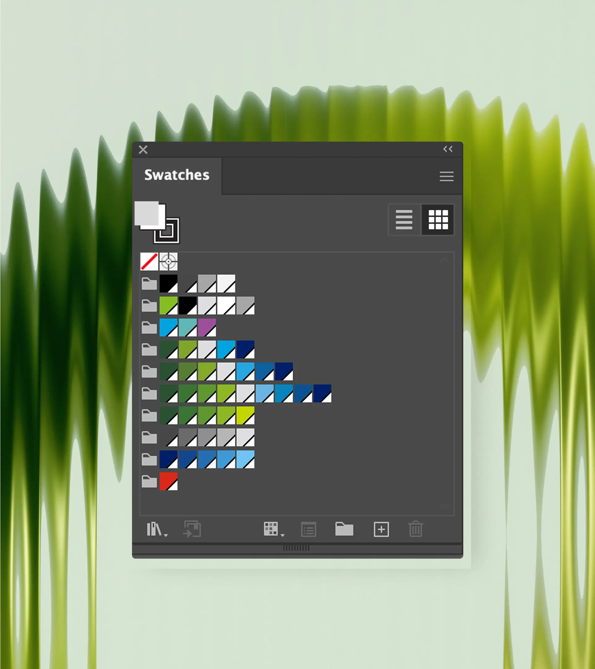
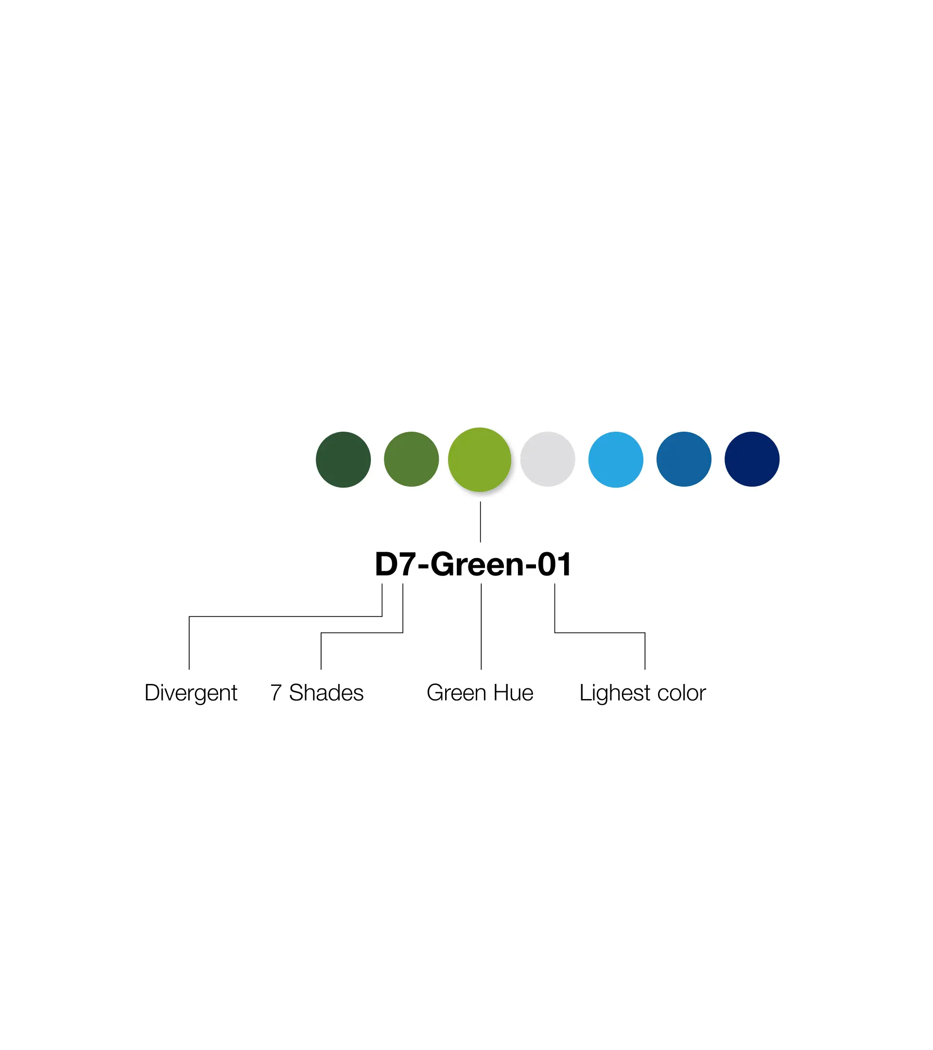
We mapped their actual production needs and rebuilt the system to bridge creative ambition with operational reality, working closely with the original design team at Pentagram:
.webp)
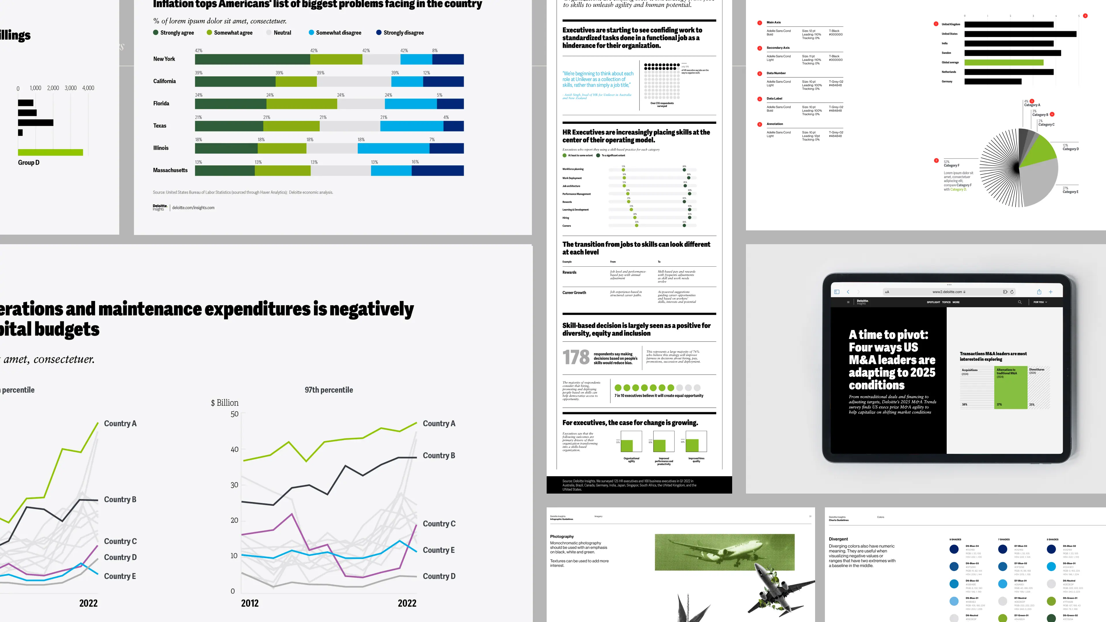


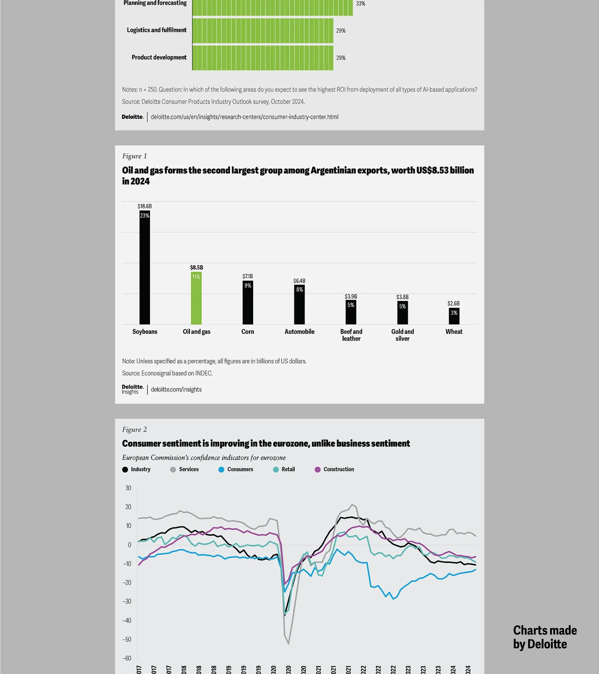
The production team now creates more consistent charts with fewer revisions.
More importantly, Deloitte's core Data Visualization team shifted from fixing other people's work to coaching teams through data challenges, gaining recognition as internal experts.

Big thanks to Giorgia for bringing us on this project and to the Deloitte Insights team for the trust.
Design Lead
Gabrielle Merite
Data Visualization Designer
Gabrielle Merite
Ting Fang Cheng
Project Manager
Madeleine Garner, Pentagram
Pentagram Partner
Giorgia Lupi
.webp)