Creative Direction
Gabrielle Merite
User Research
Amy Cesal
Data Visualization Design
Gabrielle Merite
Huong Pham
Project Management
Stewart Pickering
.webp)
In an era where quality content reigns supreme, even some of the oldest, most trusted institutions must evolve. Moody’s has been synonymous with financial risk assessment for over a century. As the company expanded beyond credit ratings into data analytics and AI-driven solutions. Moody’s invested in a refreshed brand identity designed and developed by Interbrand, the refreshed brand went live in 2024.
At the same time, Moody’s sought a specialized partner to help translate its new visual identity and voice principles via data visualization design standards. Multiple teams were producing charts without a unified approach, leading to inconsistent visual outputs across the organization. The new guidelines would not only help align global design teams, but also help to communicate the brand’s new voice of being bold, clear and perceptive across all data visualizations, a new cornerstone of the company’s multi-channel storytelling.
.webp)
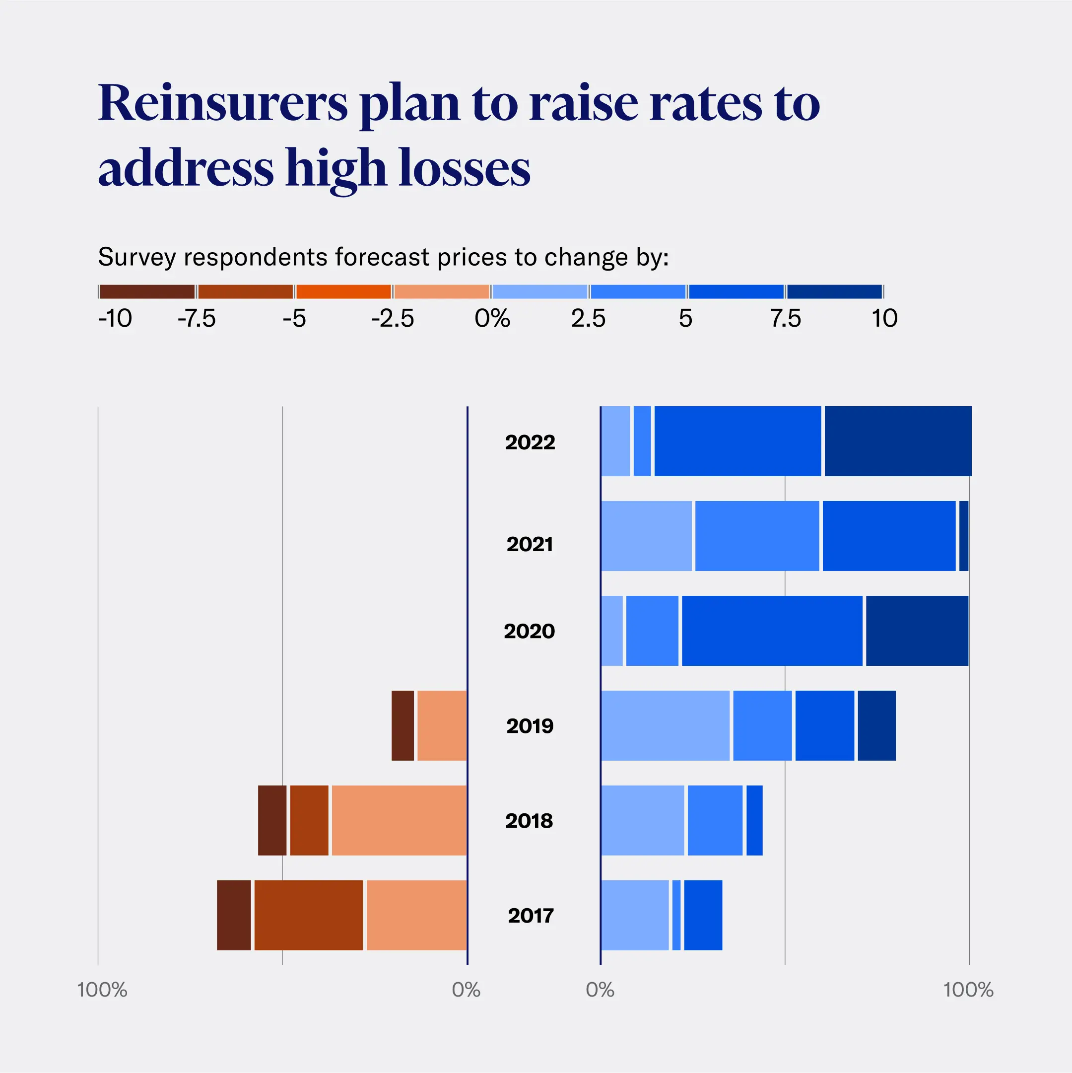
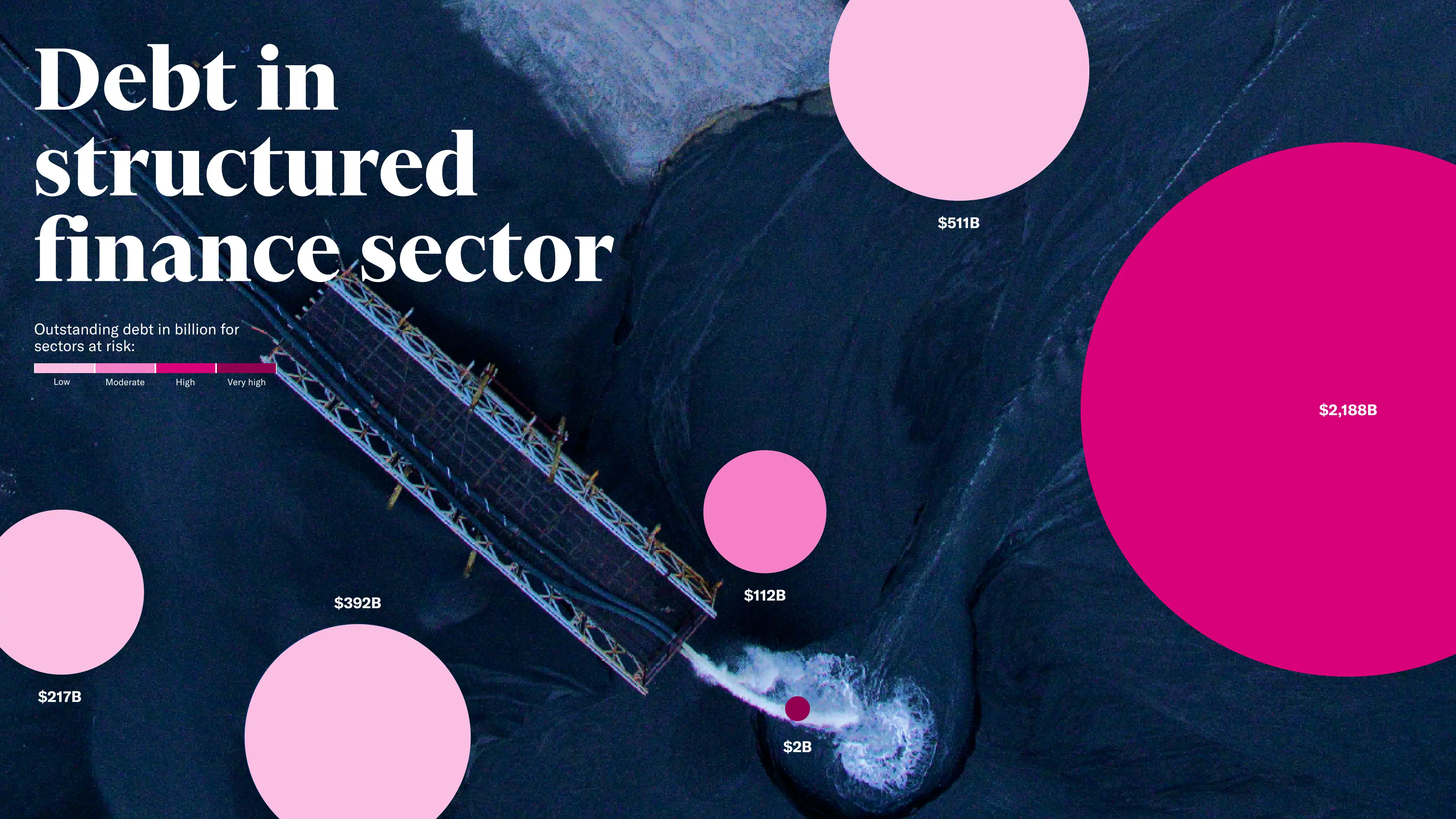
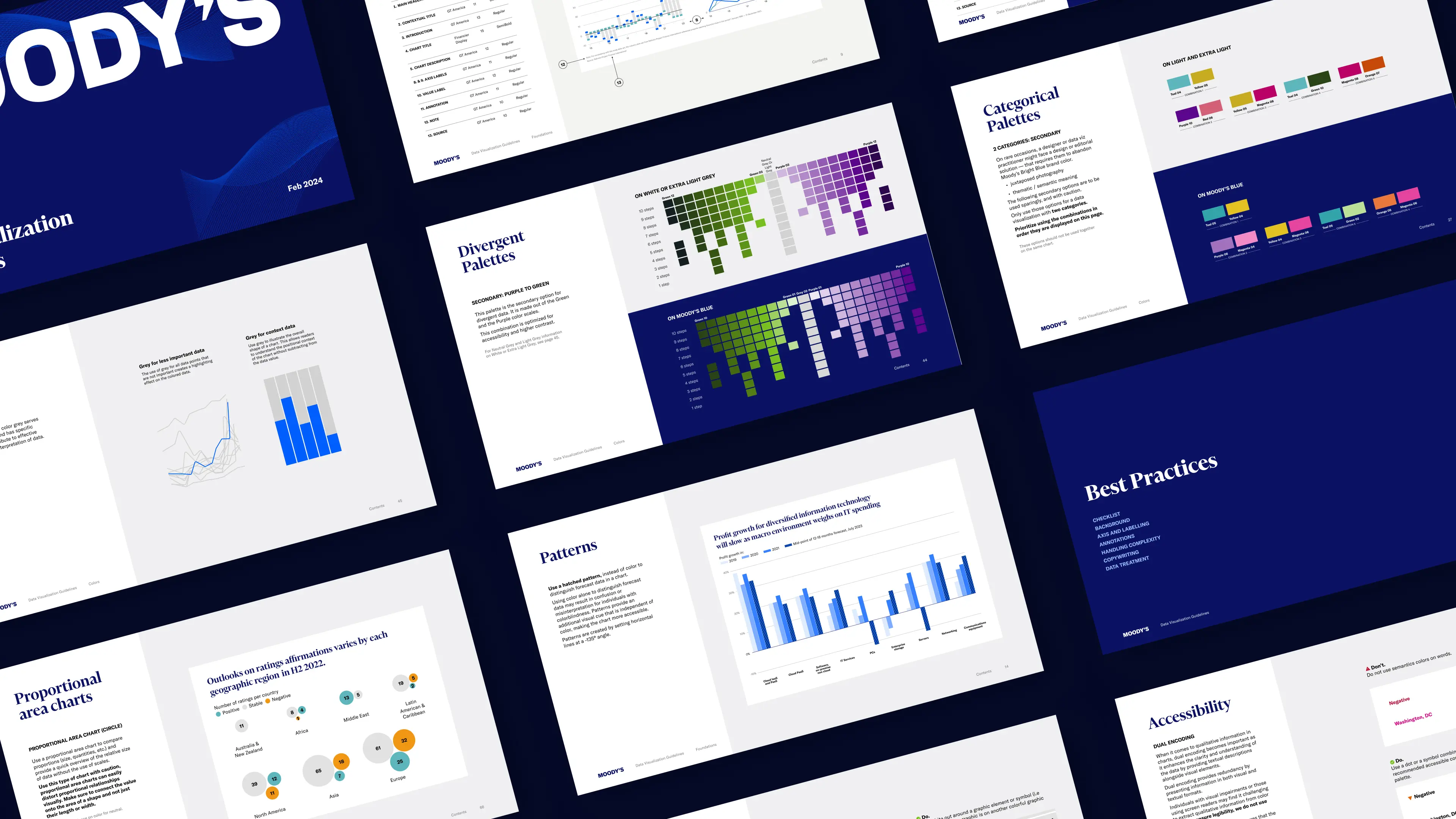
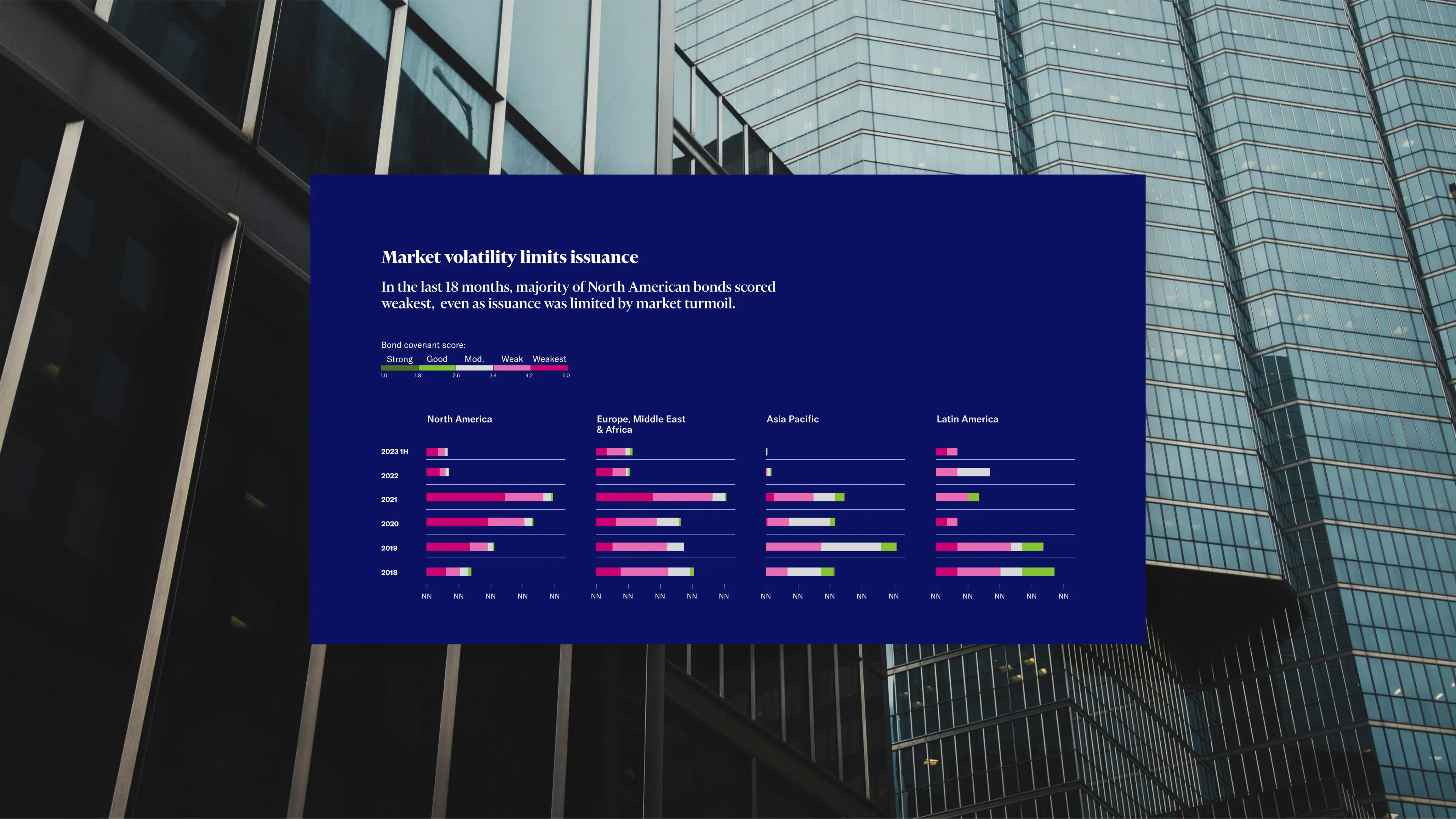
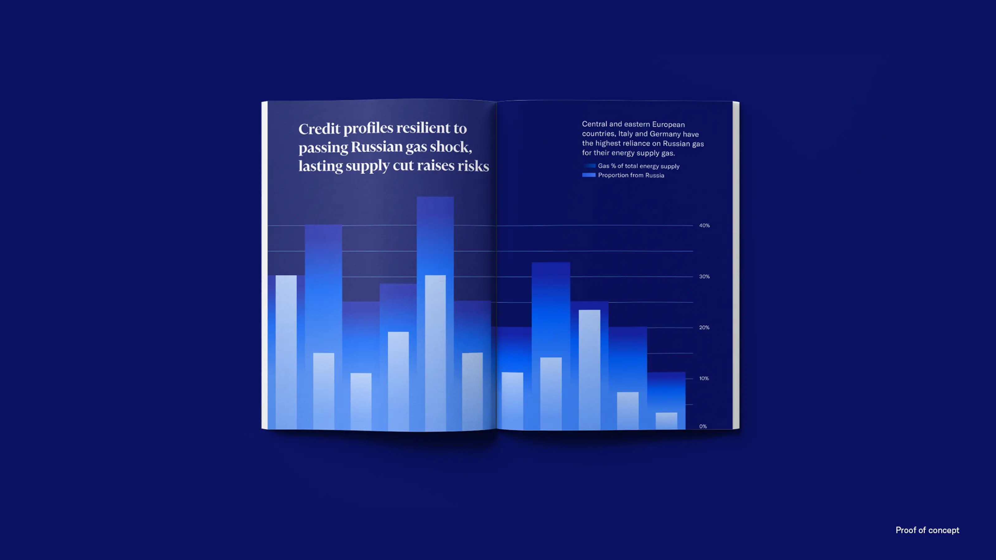
Our team, supporting Infogr8, launched a comprehensive strategy to revolutionize Moody's data visualization approach. Through extensive user interviews and a meticulous audit of over 270 existing charts, we uncovered pain points and opportunities within Moody's data visual storytelling ecosystem.
This informed our development of a phased approach to implement new data visualization design guidelines. We translated Moody's core values—Clear, Bold, and Perceptive—into tangible design decisions, creating a visual language that spoke volumes, and conducted a rigorous color accessibility audit that set a new standard.
Working collaboratively with multiple internal teams, we refined our approach to meet diverse needs while maintaining a cohesive identity.
The result was a data visualization design language that complements and propels forward Moody's brand transformation:


"The transition to our new branded data visualization system has been extraordinary, and well-received by internal stakeholders and external audiences. Adoption across the business has been tremendously successful. From data stories to infographics to social media data viz assets, the visual consistency has been monumental — and the new system wonderfully captures our company’s core principles: bold, clear and perceptive. We’re extremely proud to see the fruits of this collaboration come to life, and wouldn’t be what it is today without Gabby’s leadership and expertise."
Todd Lindeman,
VP of Data Visualization

Since the launch, Moody's has prominently featured editorial data visualizations throughout their strategic communications on moodys.com. Their LinkedIn presence and online engagement has increased, with data visualizations becoming a key driver.
Multiple teams have adopted the guidelines, reporting high satisfaction and ease of use.
From century-old credit rating agency to cutting-edge risk intelligence provider, Moody's visual transformation mirrors its business evolution. Our strategic design and data visualization work has empowered Moody's to do more than adapt to change—they now illuminate paths to prosperity in a world of interconnected risks.

Special thanks to Ivan, Todd, Silvio, Vanessa and the whole Moody's team. We had a blast and are excited to see beautiful charts coming out of Moody's! And a big thank you to infogr8 for bringing us on this project.
Creative Direction
Gabrielle Merite
User Research
Amy Cesal
Data Visualization Design
Gabrielle Merite
Huong Pham
Project Management
Stewart Pickering
.webp)